Bagian 6 Visualisasi Data
Salah satu keunggulan R dibandingkan dengan software statistika lainnya adalah kemampuan menghasilkan grafik yang sangat mumpuni, baik untuk membuat plot untuk eksplorasi data awal, validasi model, atau untuk keperluan publikasi. Setidaknya ada tiga sistem utama untuk menghasilkan grafik dalam R yaitu grafik R dasar (base R graphics), lattice dan ggplot2. Masing-masing sistem ini memiliki kekuatan dan kelemahannya masing-masing. Pada kesempatan ini, kita akan lebih fokus pada grafik R dasar dan ggplot2.
Untuk keperluan praktik pembuatan grafik, kita akan menggunakan salah satu dari data “NYS Salary Information for the Public Sector” yang dapat diperoleh di laman kaggle, di samping data-data lainnya. Untuk memudahkan proses latihan, data telah saya olah terlebih dahulu dengan perintah berikut
library(dplyr)

read.csv("data/salary-information-for-local-authorities.csv") %>%
  filter(Has.Employees != 'No') %>%
  mutate(Employee.Group = substr(Employee.Group.End.Date, 1, 4),
         Other.Allowances = Overtime.Paid +
           Performance.Bonus +
           Extra.Pay +
           Other.Compensation ) %>%
  mutate_all(na_if, "") %>%
  select(Authority.Name, Employee.Group, Title, Group, Department, Pay.Type,
         Exempt.Indicator, Base.Annualized.Salary, Actual.Salary.Paid,
         Other.Allowances, Total.Compensation, Paid.By.Another.Entity,
         Paid.by.State.or.Local.Government ) %>%
  saveRDS("data/salary.rds")
Salary <- readRDS("data/salary.rds")
glimpse(Salary)## Rows: 444,894
## Columns: 13
## $ Authority.Name <chr> "Albany County Airport Authority", "~
## $ Fiscal.Year <chr> "2019", "2019", "2019", "2019", "201~
## $ Title <chr> "Senior Account Technician", "Chief ~
## $ Employee.Group <chr> "Administrative", "Executive", "Mana~
## $ Department <chr> "Finance", "Administration", "Financ~
## $ Pay.Type <chr> "FT", "FT", "FT", "FT", "PT", "FT", ~
## $ Exempt.Indicator <chr> "Y", "Y", "Y", "Y", "Y", "Y", "Y", "~
## $ Base.Annualized.Salary <dbl> 57331.92, 185000.00, 86828.74, 84504~
## $ Actual.Salary.Paid <dbl> 57331.92, 15416.66, 86828.74, 84504.~
## $ Other.Allowances <dbl> 0.00, 0.00, 0.00, 0.00, 0.00, 0.00, ~
## $ Total.Compensation <dbl> 57331.92, 15416.66, 86828.74, 84504.~
## $ Paid.By.Another.Entity <chr> "N", "N", "N", "N", "N", "N", "N", "~
## $ Paid.by.State.or.Local.Government <chr> NA, NA, NA, NA, NA, NA, NA, NA, NA, ~6.1 Grafik R dasar
6.1.1 Histogram
Membuat histogram dapat dilakukan dengan fungsi hist()
hist(Salary$Actual.Salary.Paid)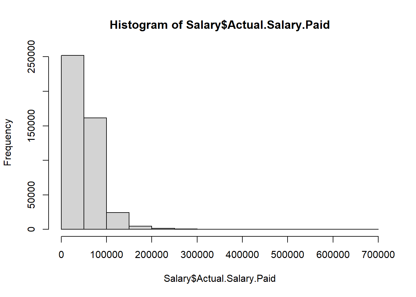
hist(Salary$Actual.Salary.Paid, freq = FALSE)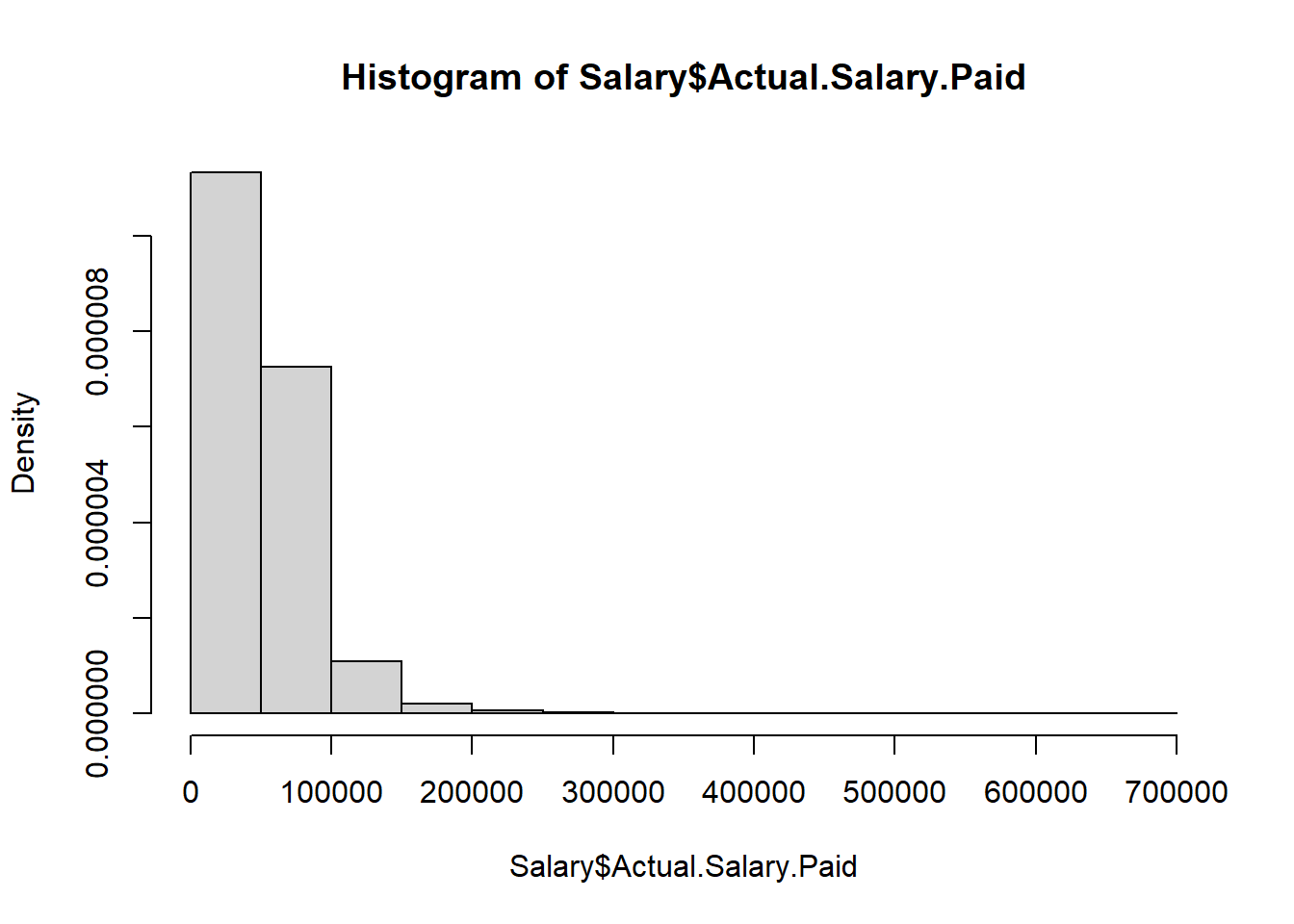
hist(Salary$Actual.Salary.Paid, freq = FALSE, breaks = 50)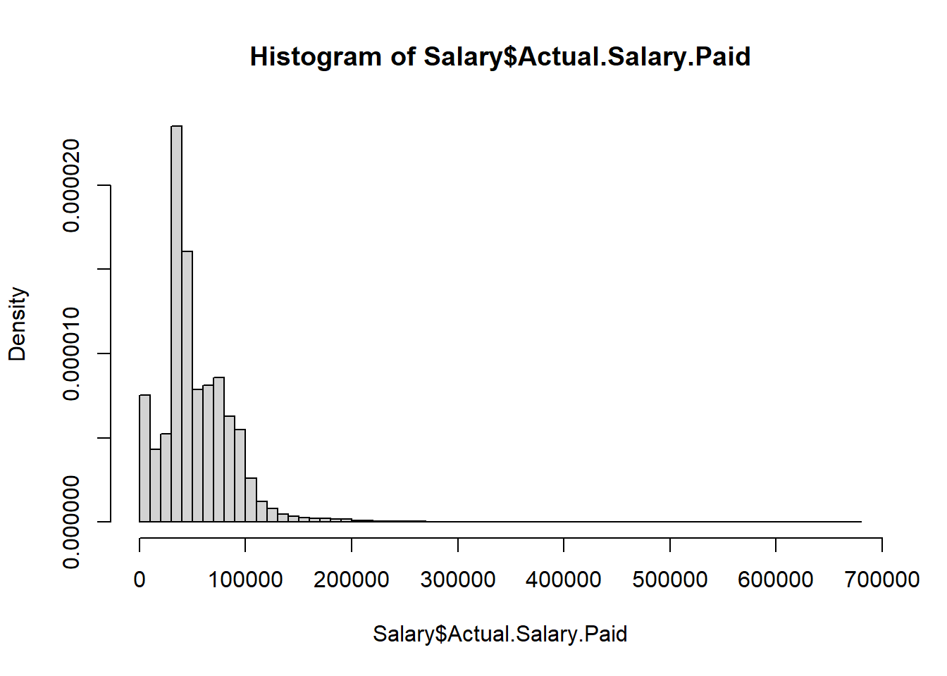
plot(density(Salary$Actual.Salary.Paid, bw = 0.5))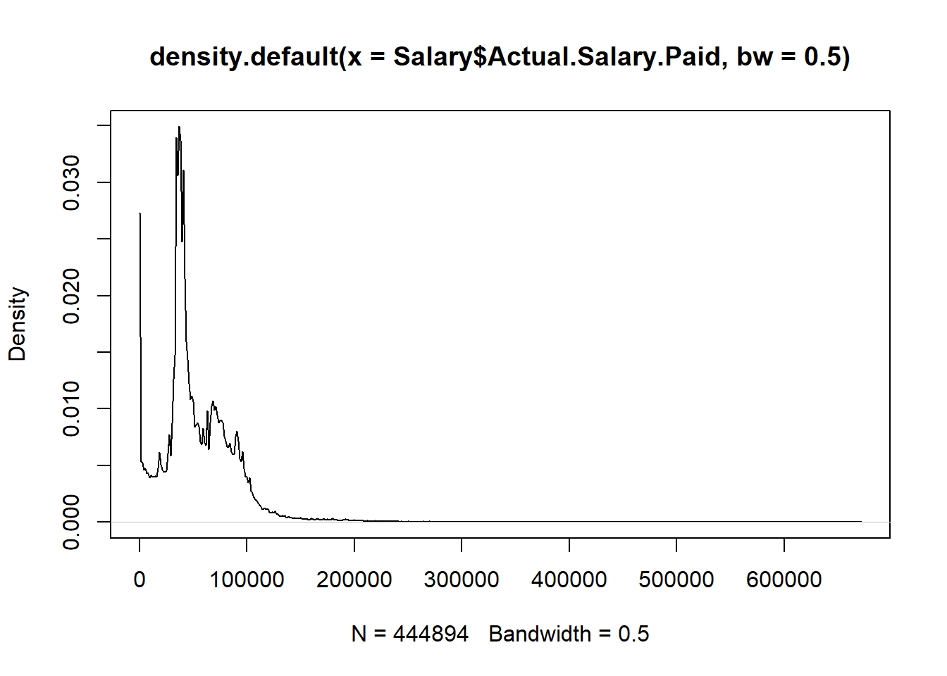
6.1.2 Bar plot
counts <- table(Salary$Employee.Group)
counts
##
## Administrative Executive Managerial Operational Professional
## 65857 1864 37986 115146 132906
## Technical
## 91135barplot(counts)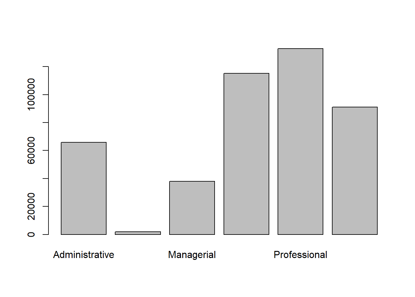
barplot(counts, cex.names=.8)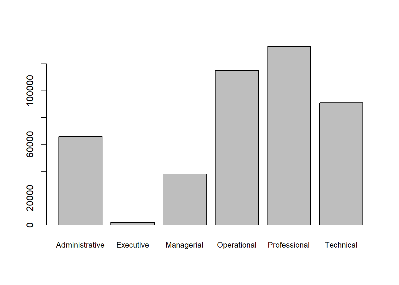
counts <- table(Salary$Pay.Type, Salary$Employee.Group)
barplot(counts, cex.names=.8)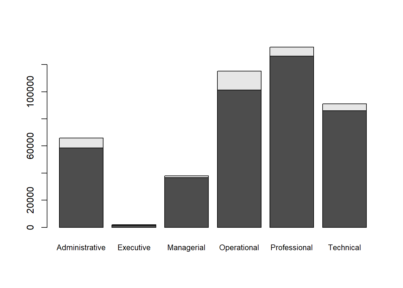
barplot(counts,
        col = c("#ffd166","#06d6a0"), #custom colors
        legend = rownames(counts),
        cex.names=.8)
barplot(counts,
        col = c("#ffd166","#06d6a0"),
        legend = rownames(counts),
        beside = TRUE,
        cex.names=.8)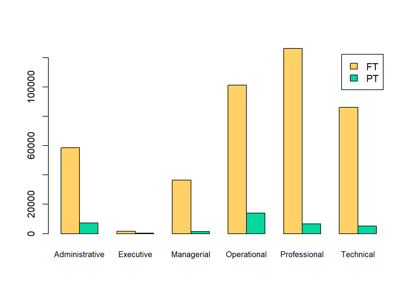
6.1.3 Scatter plot
x = seq(from = -2*pi, to = 2*pi, length.out = 100)
y = 2*sin(x)
plot(x,y)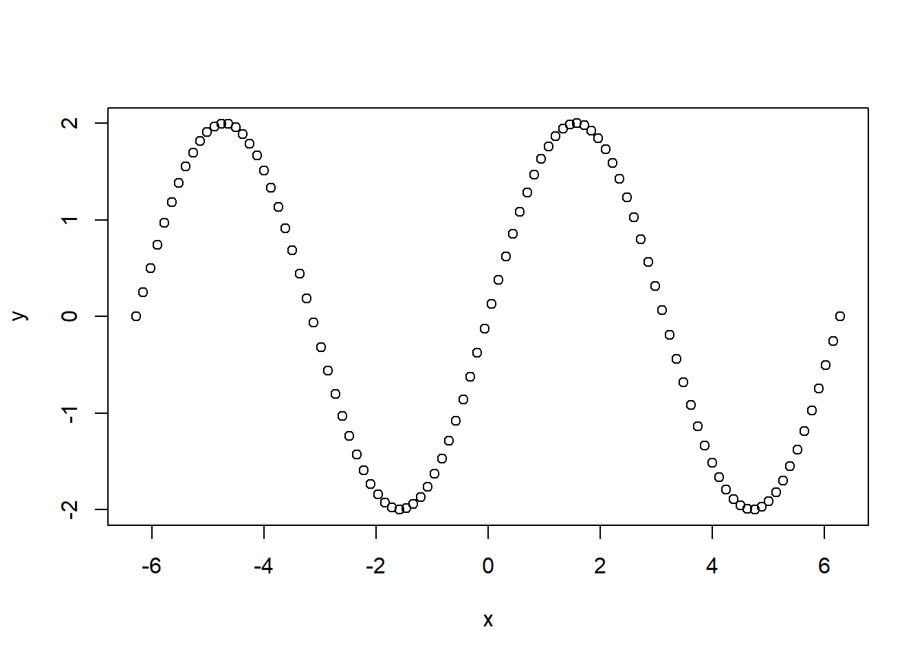
plot(x,y, type = "l")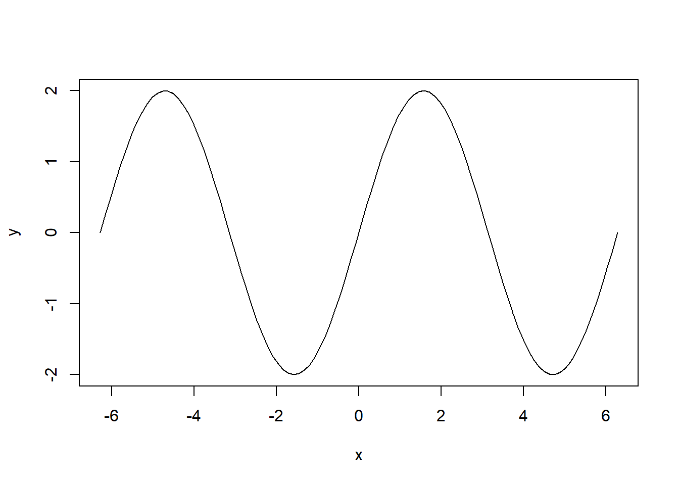
plot(x,y, type = "h")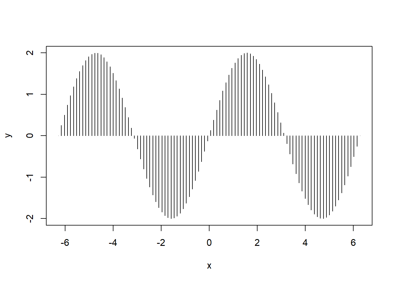
Salary100 <- Salary[1:1000,]
plot(Salary100$Base.Annualized.Salary, Salary100$Total.Compensation)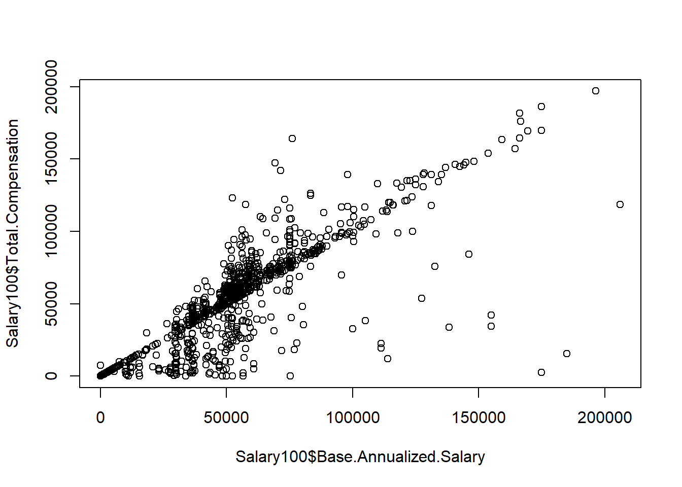
plot(Salary100$Base.Annualized.Salary, Salary100$Total.Compensation, pch = 19)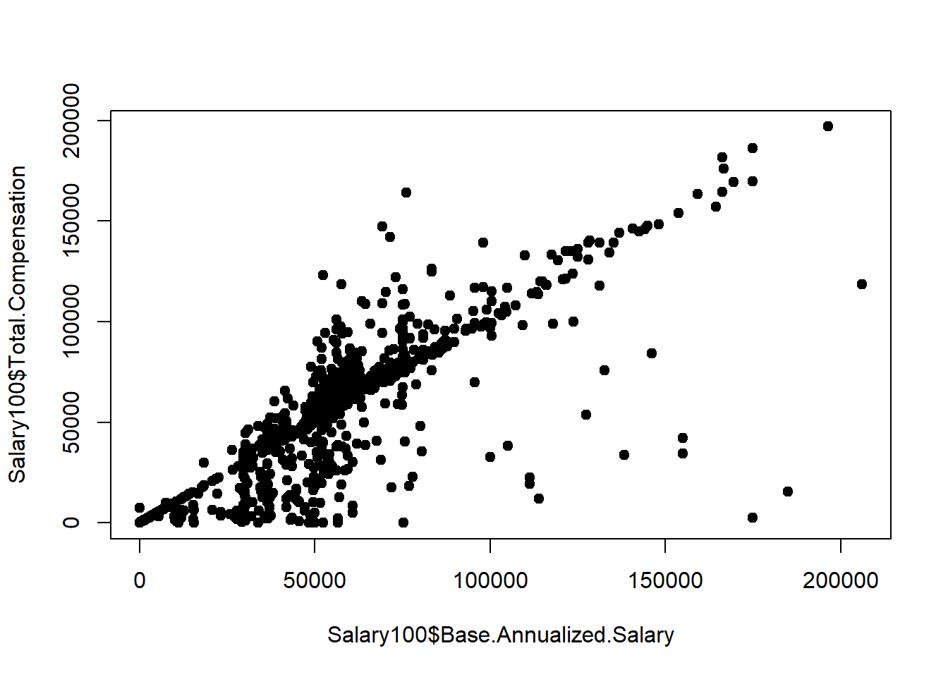
Salary100$Employee.Group <- as.factor(Salary100$Employee.Group)
plot(Salary100$Base.Annualized.Salary, Salary100$Total.Compensation,
     col = Salary100$Employee.Group, pch = 16)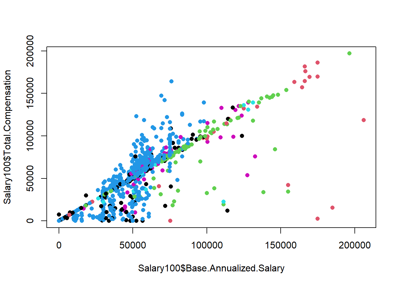
Salary100$Employee.Group <- as.factor(Salary100$Employee.Group)
plot(Salary100$Base.Annualized.Salary, Salary100$Total.Compensation,
     col = Salary100$Employee.Group, pch = 16)
legend(x = 0, y = 200000, legend = levels(Salary100$Employee.Group), col = 1:6, pch = 19)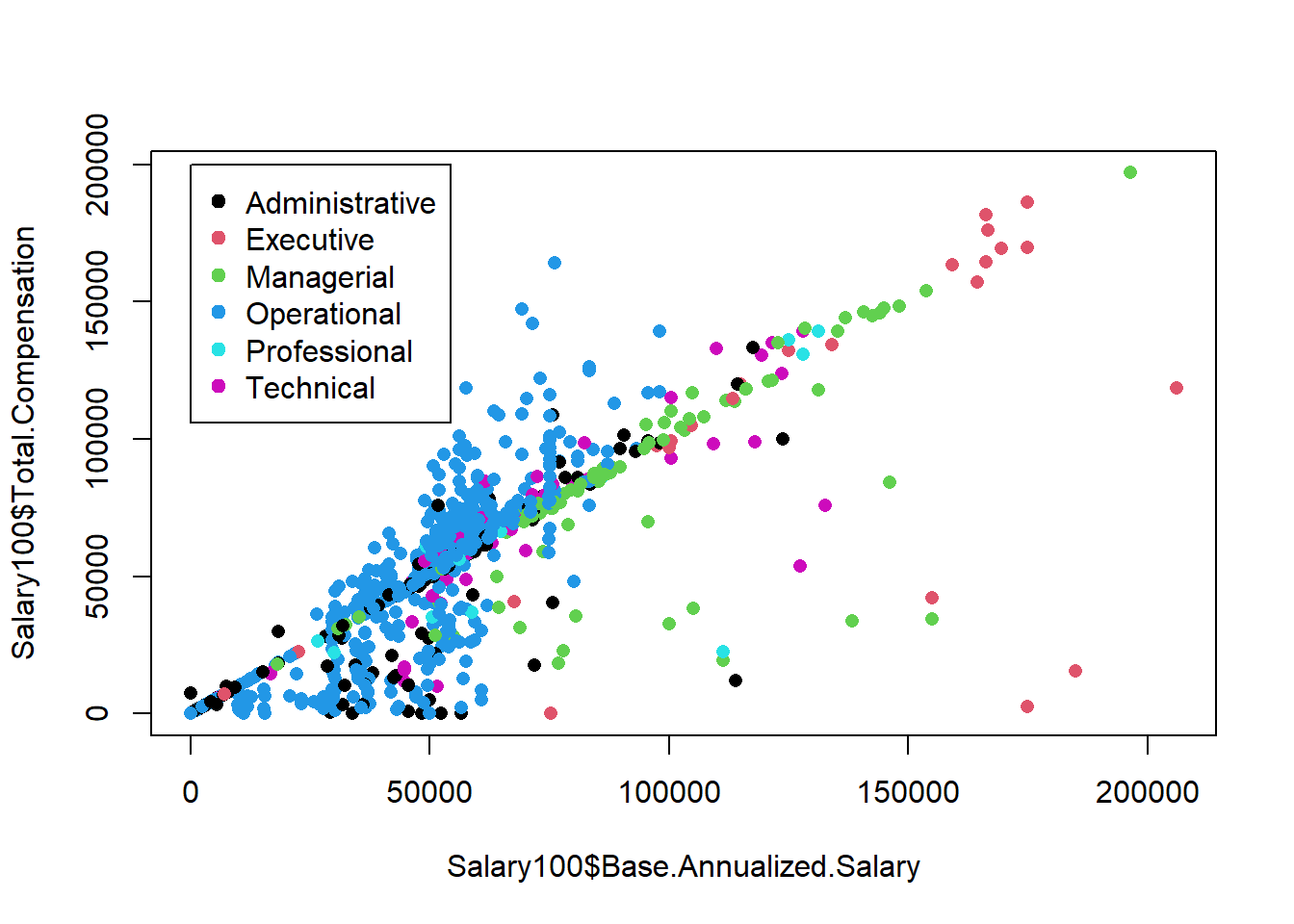
mean.Total.Compensation <- mean(Salary100$Total.Compensation)
mean.Base.Annualized.Salary <- mean(Salary100$Base.Annualized.Salary)
plot(Salary100$Base.Annualized.Salary, Salary100$Total.Compensation, pch = 19)
points(mean.Base.Annualized.Salary, mean.Total.Compensation , pch = 15, col = 'red', cex = 1.5)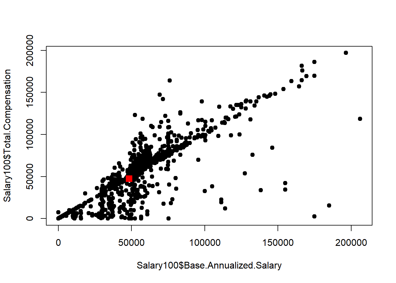
pairs(~ Total.Compensation + Base.Annualized.Salary + Actual.Salary.Paid + Other.Allowances, data = Salary100)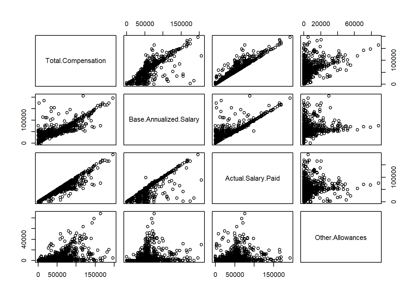
6.1.4 Line plot
plot(x,y)
lines(x, sin(x))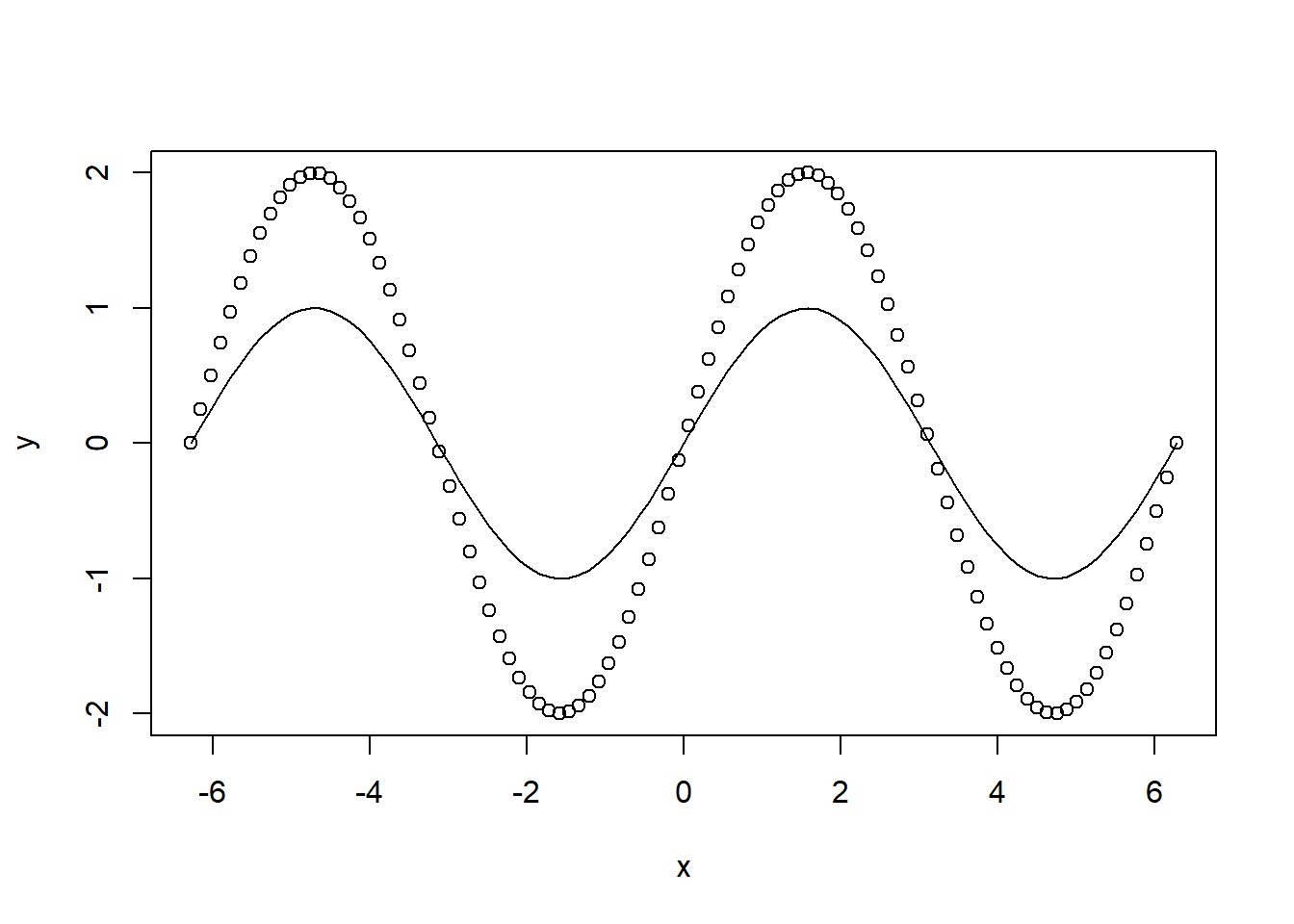
x <- 1:40
y <- rnorm(40,5,1)
plot(x,y,type="o")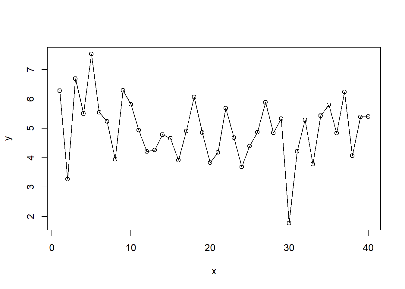
plot(Salary100$Base.Annualized.Salary, Salary100$Total.Compensation, pch = 19)
# regression line (y~x)
abline(lm(Total.Compensation~Base.Annualized.Salary, data = Salary100), col = "red")
# lowess line (x,y)
lines(lowess(Salary100$Base.Annualized.Salary,Salary100$Total.Compensation), col = "blue") 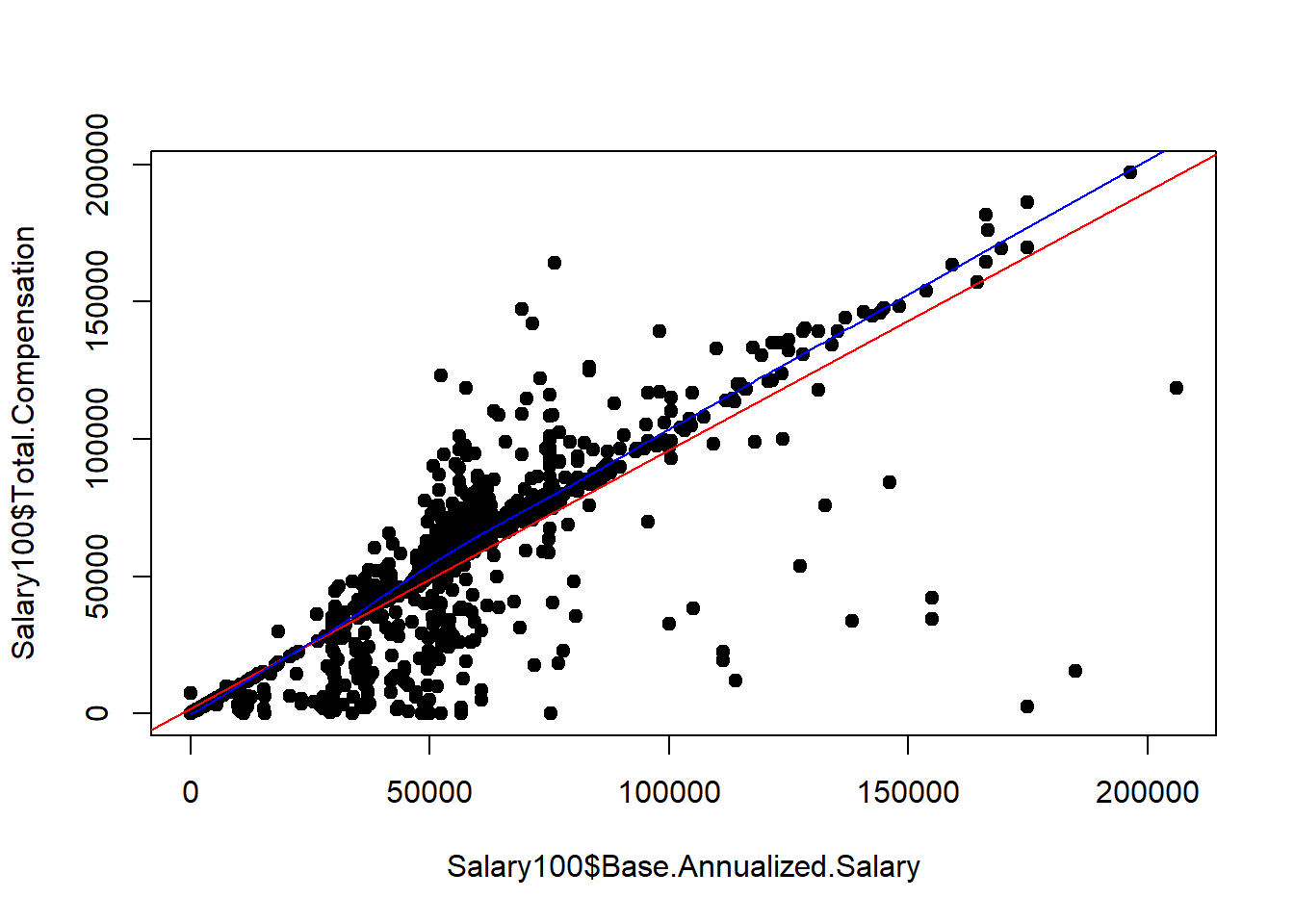
6.1.5 Pie chart
tbl.Employee <- table(Salary$Employee.Group)
pie(tbl.Employee)
mytable <- table(iris$Species)
lbls <- paste(names(mytable), "\n", mytable, sep="")
pie(mytable, labels = lbls,
   main="Pie Chart of Species\n (with sample sizes)")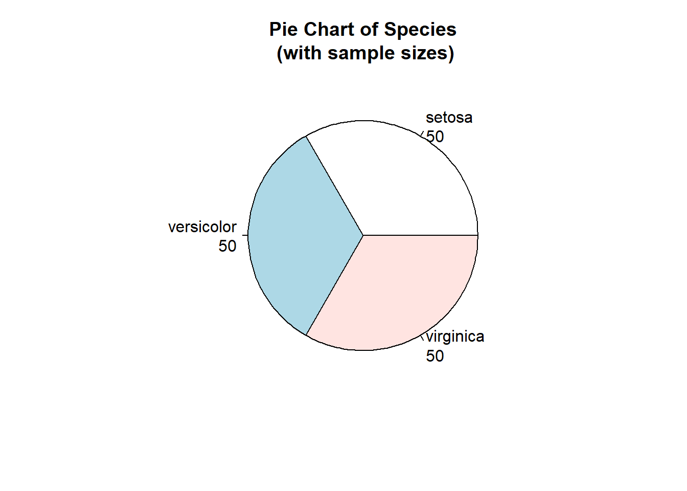
6.1.6 Boxplot
boxplot(Salary$Actual.Salary.Paid)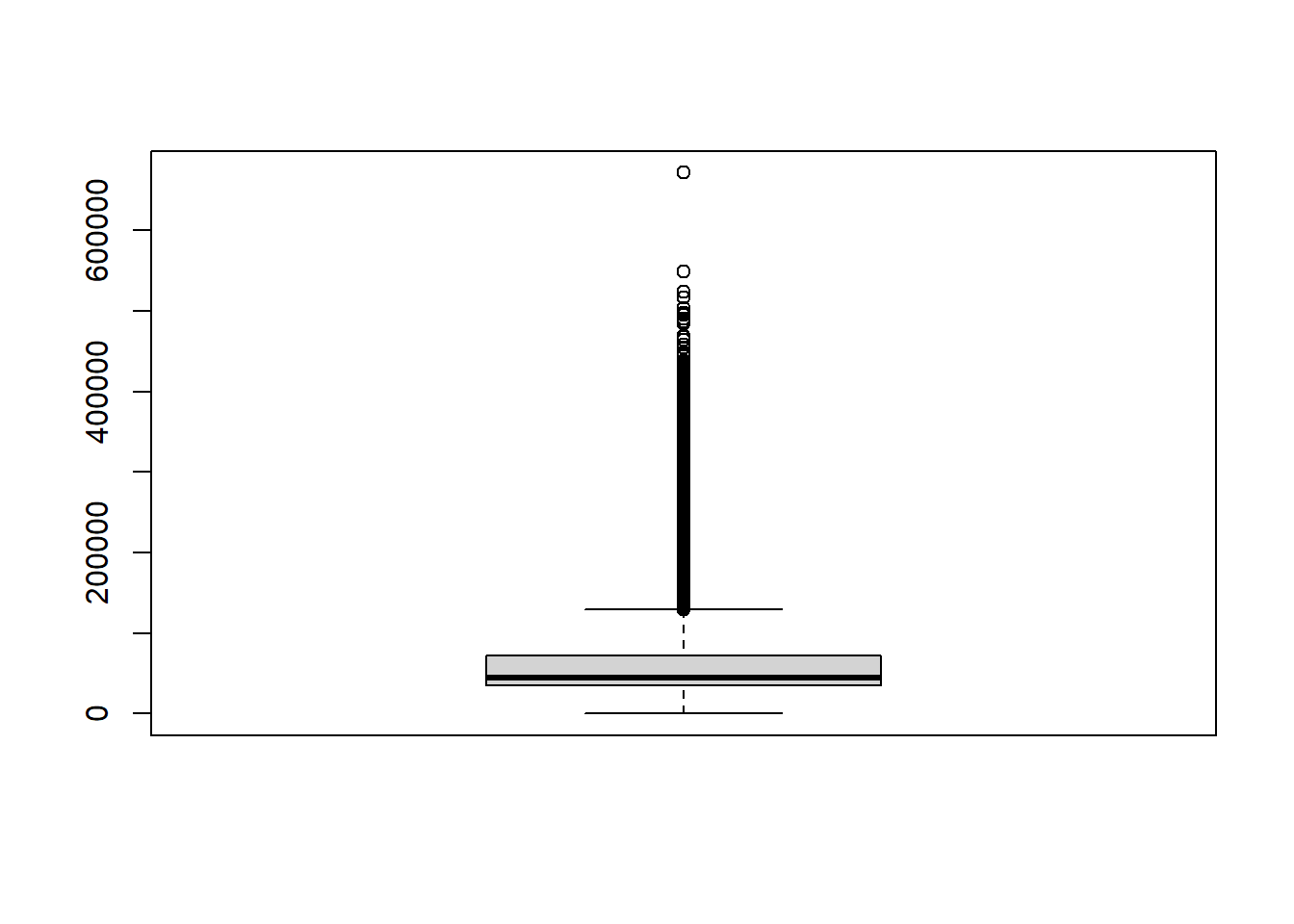
boxplot(Actual.Salary.Paid ~ Employee.Group, data = Salary, cex.axis=.8)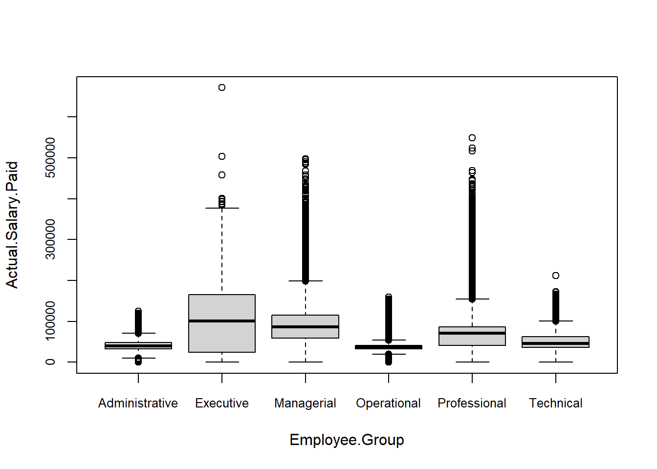
boxplot(Actual.Salary.Paid ~ Employee.Group, data = Salary,
        notch = TRUE,
        col = RColorBrewer::brewer.pal(length(unique(Salary$Employee.Group)),'Set2'),
        cex.axis=.8)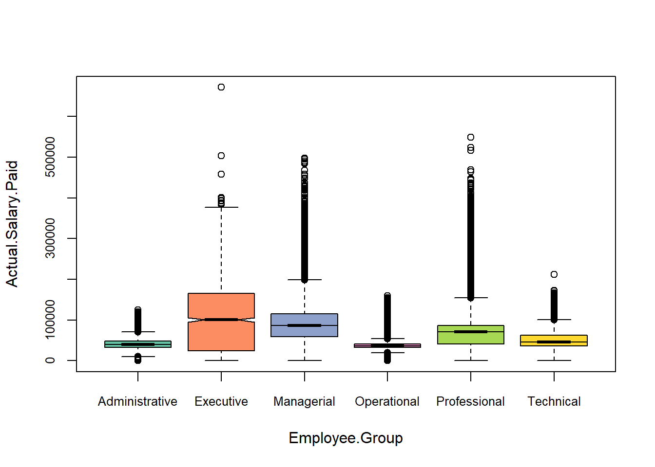
6.1.7 Layout
par(mfrow = c(2,2), cex.main = 0.75)

## plot 1
plot(Salary$Base.Annualized.Salary, Salary$Total.Compensation,
     main = "Scatterplot of Base Annualized Salary vs. Total Compensation")

## plot 2
hist(Salary$Total.Compensation,
     main = "Histogram of Total Compensation")

## plot 3
boxplot(Salary$Actual.Salary.Paid,
        main = "Actual Salary Paid")

## plot 4
barplot(table(Salary$Employee.Group),
        las = 2,
        cex.names = 0.65,
        main = "Barplot of Employee Group")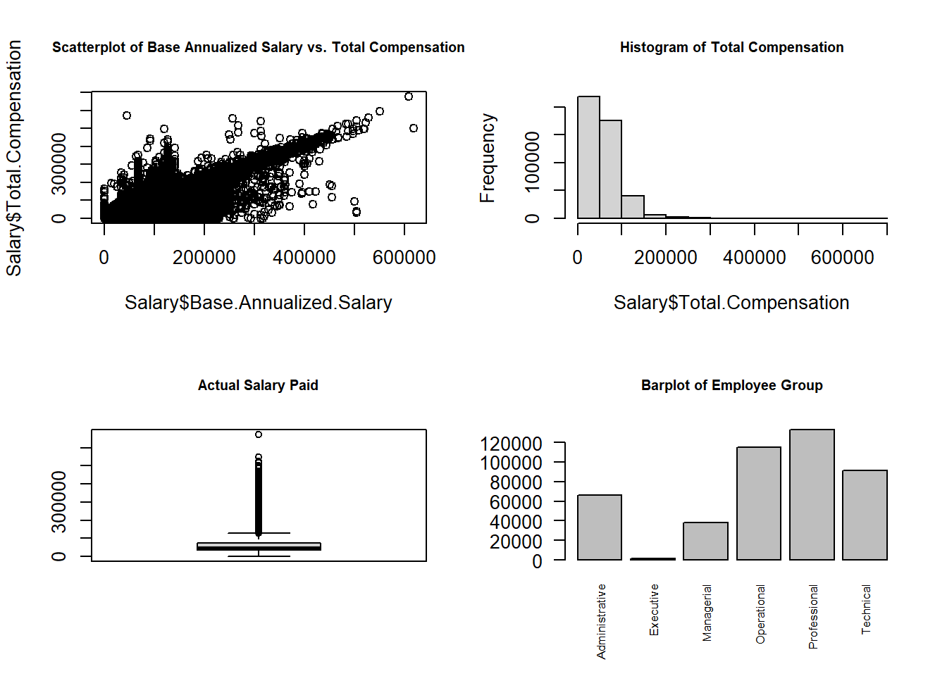
par(mfrow = c(2,1), cex.main = 0.75)

## plot 1
plot(Salary$Base.Annualized.Salary, Salary$Total.Compensation,
     main = "Scatterplot of Base Annualized Salary vs. Total Compensation")

## plot 2
barplot(table(Salary$Employee.Group),
        las = 2,
        cex.names = 0.65,
        main = "Barplot of Employee Group")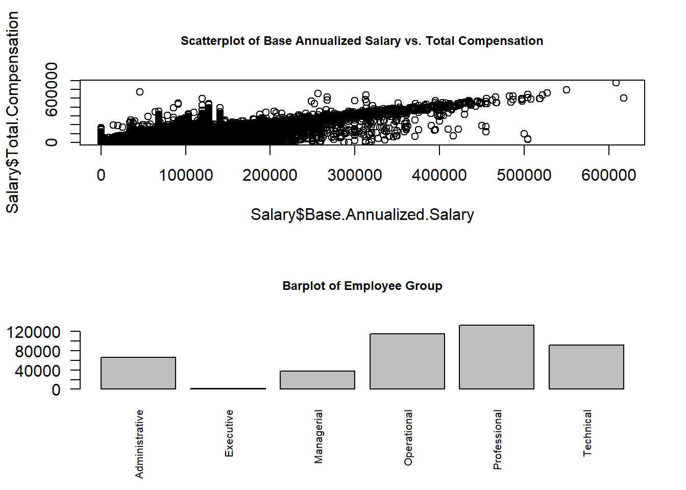
layout(matrix(c(1,1,2,3), 2, 2, byrow = TRUE))
hist(Salary$Actual.Salary.Paid, breaks = 50)
hist(Salary$Base.Annualized.Salary)
hist(Salary$Total.Compensation)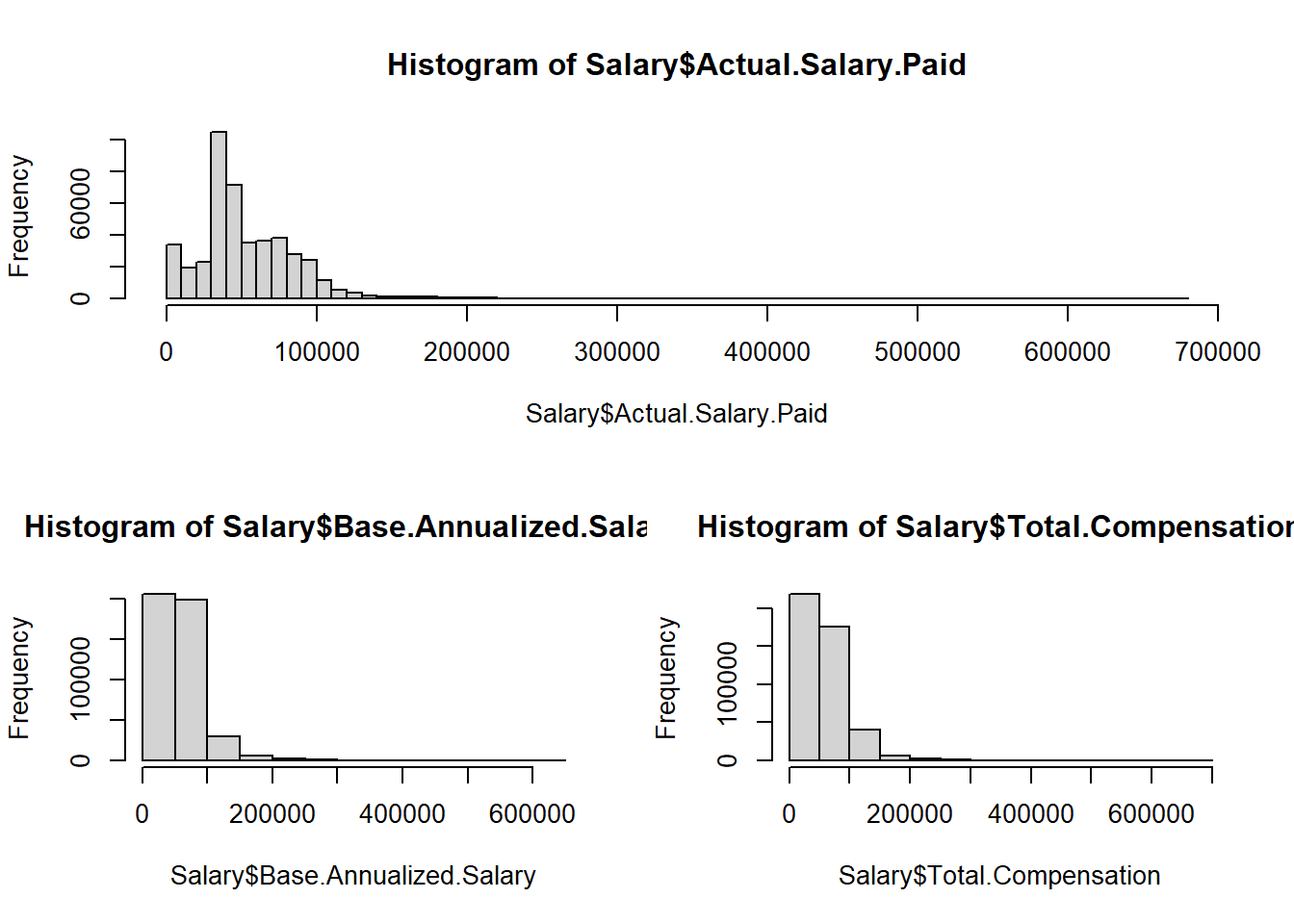
par(cex.main = 0.7)
layout(matrix(c(1,1,2,3), 2, 2, byrow = TRUE),
       widths = c(3,1)) # column 2 is 1/3 the width of the column 1

hist(Salary$Actual.Salary.Paid, breaks = 50)
hist(Salary$Base.Annualized.Salary)
hist(Salary$Total.Compensation)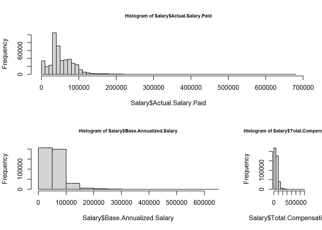
6.1.8 Latihan/Responsi
6.1.8.1 Latihan 1
Buatlah scatter plot seperti gambar berikut
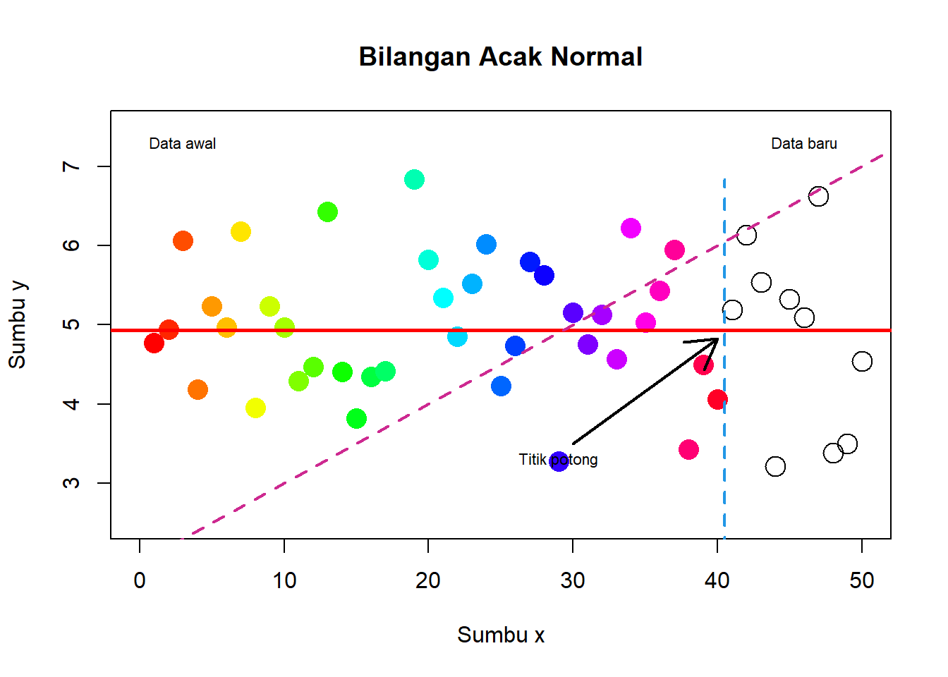
# data awal
x <- 1:40
y <- rnorm(40,5,1)

# data baru
x1 <- 41:50
y1 <- rnorm(10,5,1)

# scatter plot dg data awal
plot(x, y, type="p",
     xlab="Sumbu x",
     ylab="Sumbu y",
     main="Bilangan Acak Normal",
     col=topo.colors(40),
     pch=16, cex=2, xlim=c(0,50), ylim=c(2.5,7.5))

# plot data baru
points(x1, y1, cex=2)

#menambahkan garis
x2 <- rep(40.5,20)
y2 <- seq(min(c(y,y1)), max(c(y,y1)), length=20)

abline(v = 40.2, col="blue")
abline(h=mean(y), col="red", lwd=2.5)
abline(a=2, b=1/10, col="purple", lwd=2, lty=2)

#menambahkan tanda panah
arrows(x0=30, y0=3.5, x1=40, y1=mean(y)-.1, lwd=2)

#menambahkan tulisan
text(x=29,y=3.3, labels="Titik potong", cex=0.7)
text(x=3,y=7.3, labels="Data awal", cex=0.7)
text(x=46,y=7.3, labels="Data baru", cex=0.7)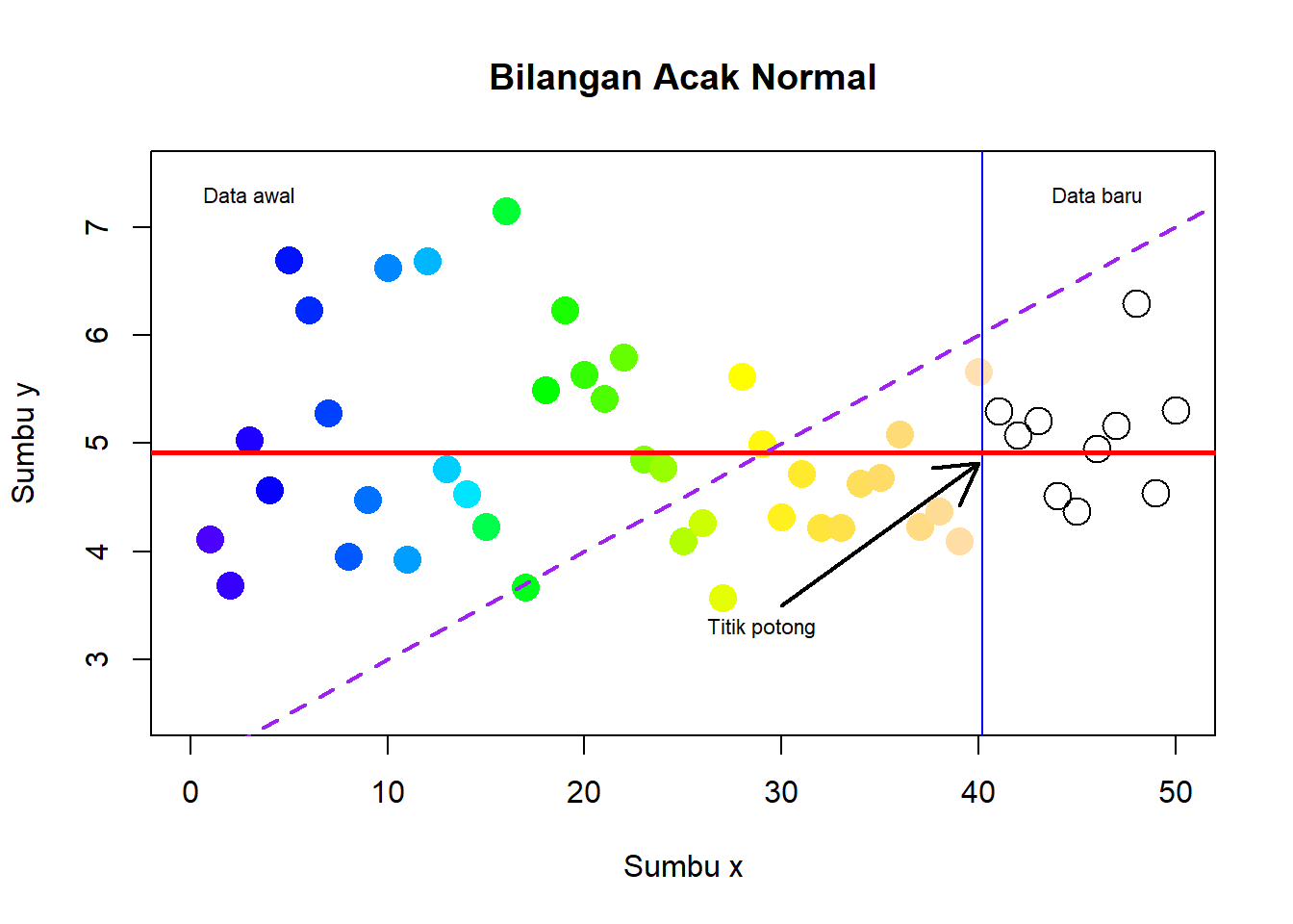
6.1.8.2 Latihan 2
Buatlah density histogram dan kurva dari contoh acak yang menyebar Chi-Squared dengan derajat bebas 4.
x <- rchisq(1000,df=4)
hist(x, freq=FALSE, ylim=c(0,0.2),
     main = "Histogram of Random Variable ~ Chi-Squared(4)")
curve(dchisq(x,df=4), col=2, lty=2, lwd=2, add=TRUE)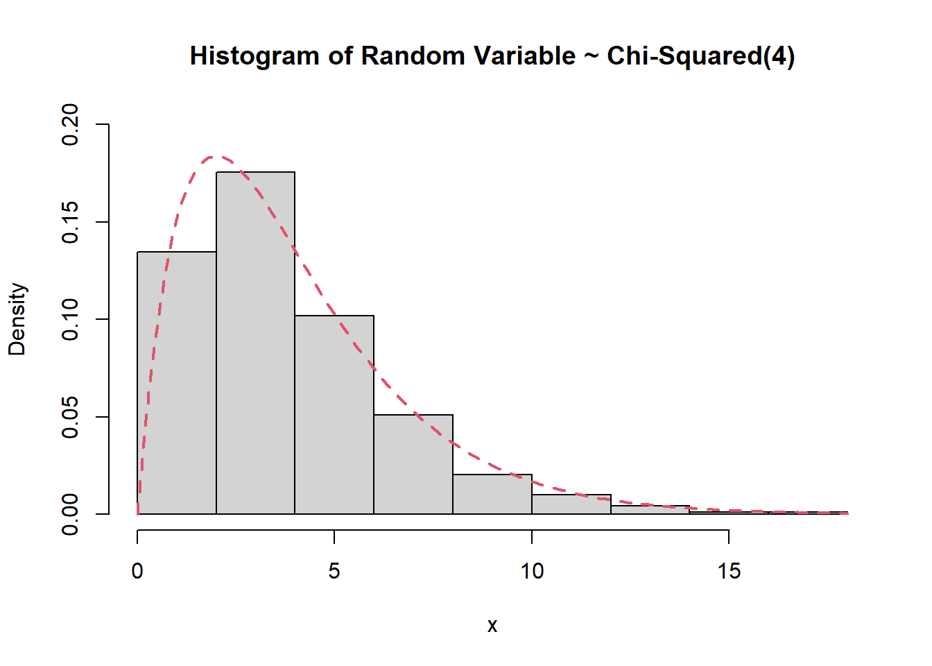
6.1.8.3 Latihan 3
Buatlah grafik seperti berikut
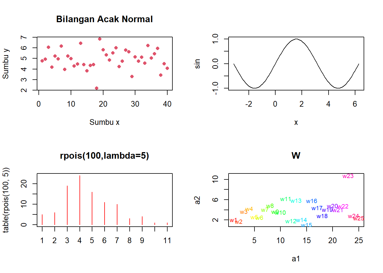
a1 <- 1:25
a2 <- rnorm(25,4,2)

x <- seq(0,10,0.1)
sin <- sin(x)

par(mfrow=c(2,2))

plot(1:40,y,type="p",xlab="Sumbu x",ylab="Sumbu y",
     main="Bilangan Acak Normal",col=2,pch=16)

y=plot(x, sin, type="l")

plot(table(rpois(100,5)),type="h",col="red",
     lwd=1,main="rpois(100,lambda=5)")

plot(a1,a2,type="n",main="W")
text(a1,a2,labels=paste("w",1:25,sep=""),
     col=rainbow(25),cex=0.8)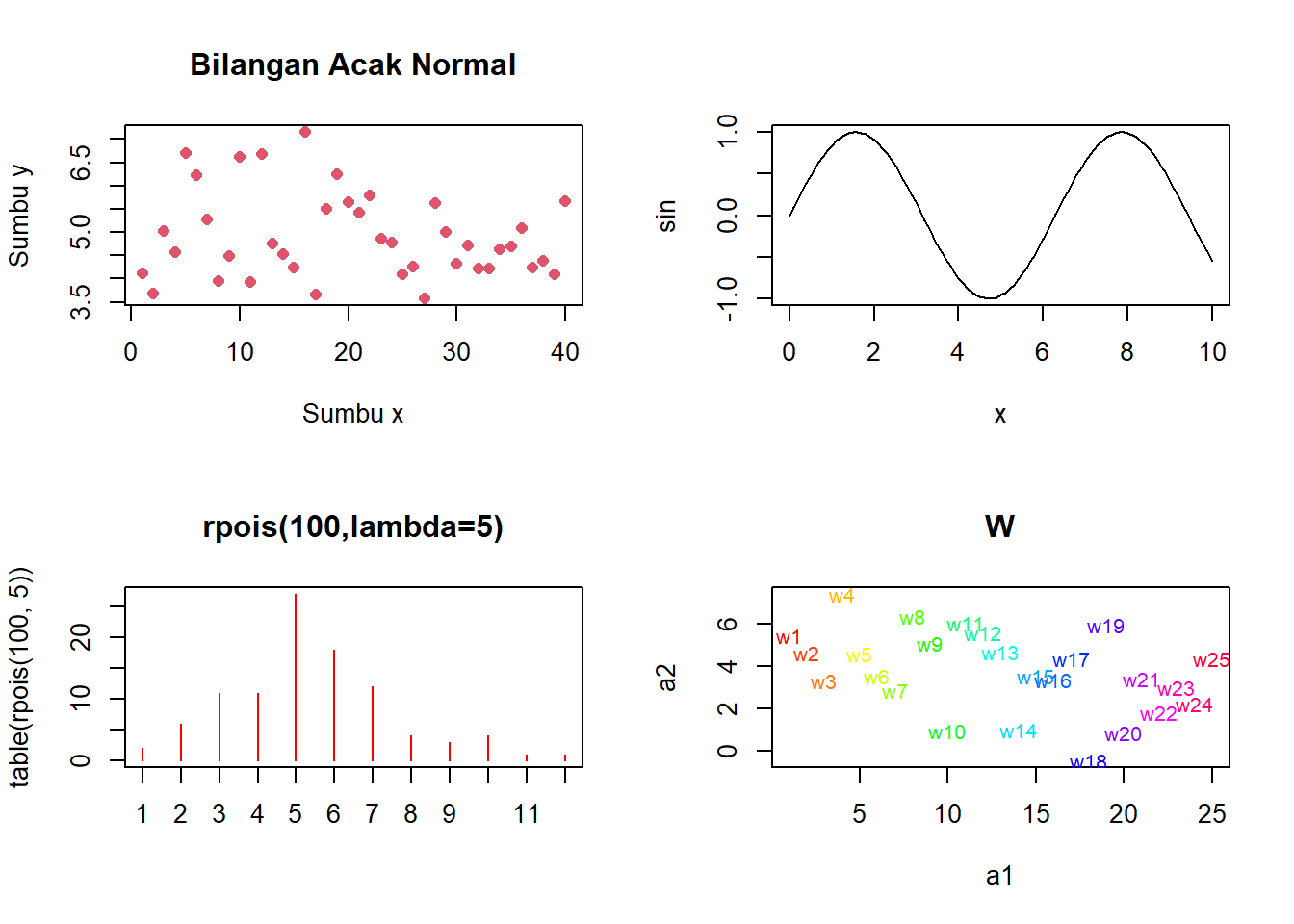
6.1.8.4 Latihan 4
Buat empat grafil dalam satu windows, dengan format berikut:
yb <- rnorm(100,5,1)
xb <- 1:100

par(mfrow=c(2,2))

plot(xb, yb, pch=16, col=rainbow(100))
title("Scatter Plot Bilangan Acak Normal",cex.main=0.7)

x <- yb
hist(yb, freq=FALSE, main=NULL, ylim=c(0,0.5))
curve(dnorm(x,5,1), col="red", lty=2, lwd=2, add=TRUE)
title("Histogram Bilangan Acak Normal", cex.main=0.7)

boxplot(yb)
title("Boxplot Bilangan Acak Normal",cex.main=0.7)

plot(xb, yb, type="l",lwd=2,col="blue")
title("Line Plot Bilangan Acak Normal",cex.main=0.7)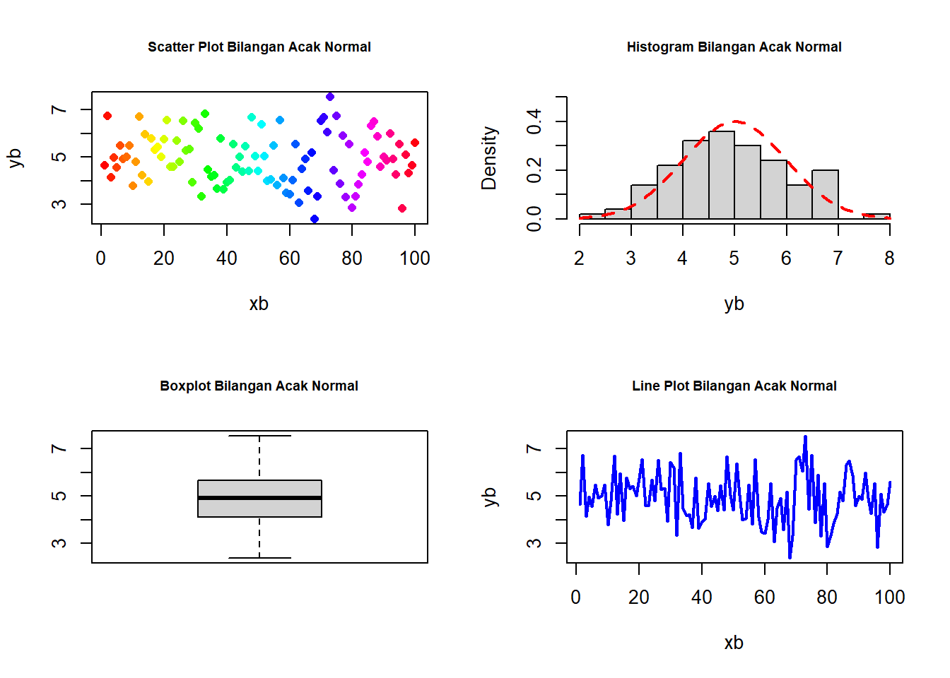
6.2 ggplot2
library(ggplot2)6.2.1 Histogram
ggplot(Salary, aes(x=Total.Compensation)) +
    geom_histogram()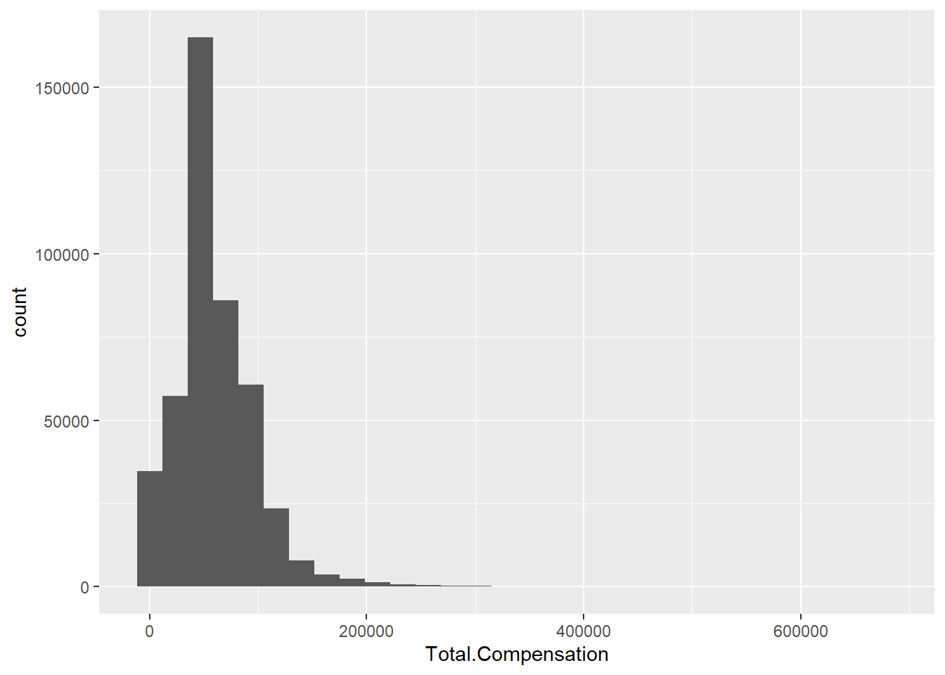
ggplot(Salary, aes(x=Total.Compensation)) +
    geom_histogram(binwidth=10000, colour="black", fill="white")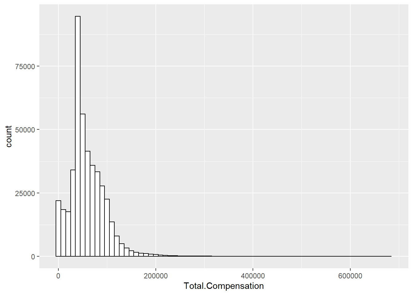
ggplot(Salary, aes(x=Total.Compensation)) + geom_density()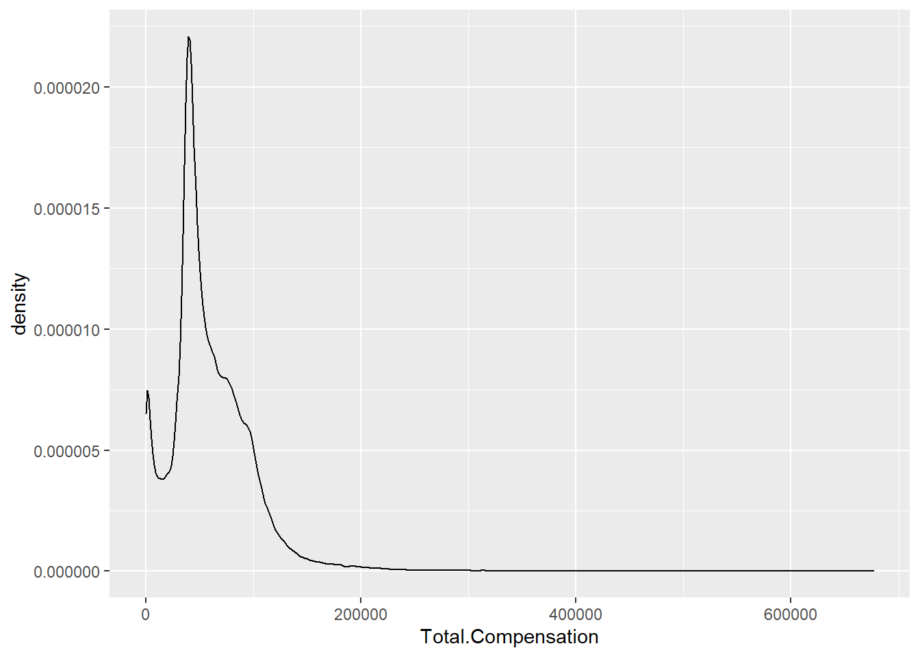
ggplot(Salary, aes(x=Total.Compensation)) +
    geom_histogram(aes(y=..density..),
                   binwidth=10000,
                   colour="black", fill="white") +
    geom_density(alpha=.2, fill="#FF6666")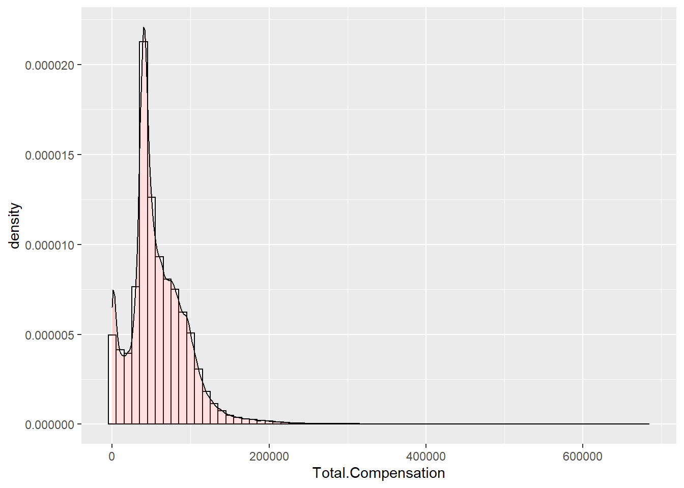
ggplot(Salary, aes(x=Total.Compensation, fill=Pay.Type)) +
    geom_histogram(binwidth=10000, alpha=.5, position="identity")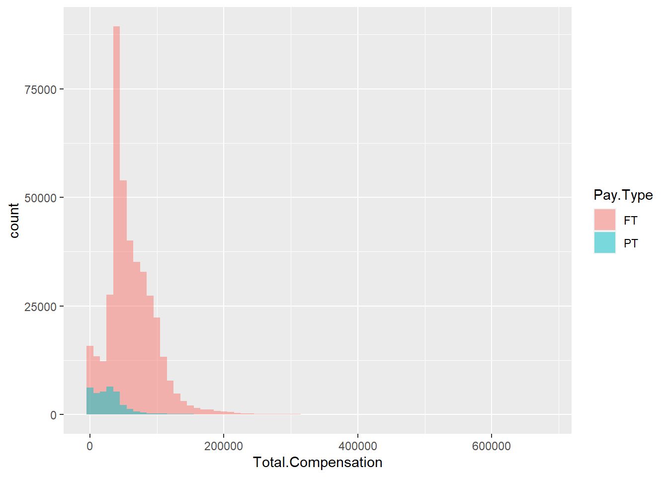
ggplot(Salary, aes(x=Total.Compensation)) +
  geom_histogram(binwidth=10000, colour="black", fill="white") +
  facet_grid(Pay.Type ~ .)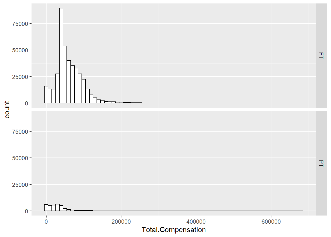
6.2.2 Scatterplot
ggplot(Salary100, aes(x=Base.Annualized.Salary, y=Total.Compensation)) +
    geom_point(shape=1) # hollow circles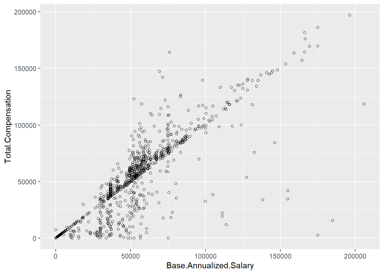
ggplot(Salary100, aes(x=Base.Annualized.Salary, y=Total.Compensation, color = Employee.Group)) +
    geom_point(shape=1) # hollow circles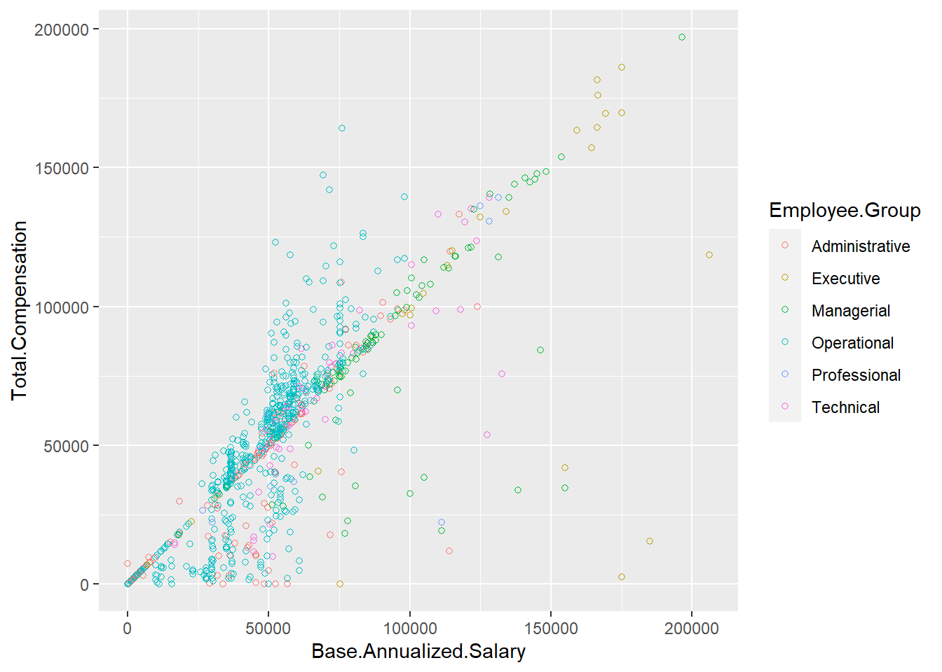
6.2.3 Barplot
ggplot(Salary, aes(x=Employee.Group)) +
    geom_bar(stat="count")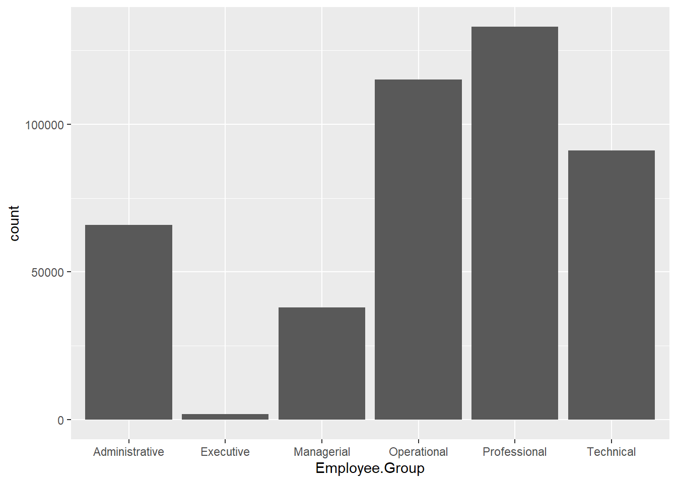
ggplot(Salary, aes(x=Employee.Group, fill=Employee.Group)) +
    geom_bar(stat="count")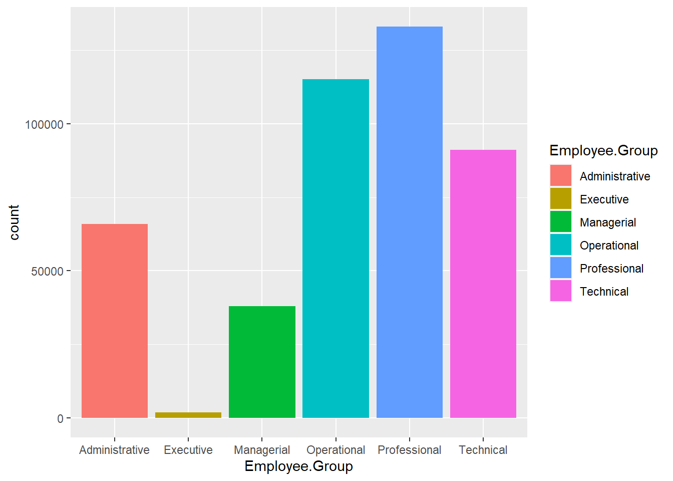
ggplot(Salary, aes(x=Employee.Group, fill=Pay.Type)) +
    geom_bar(stat="count")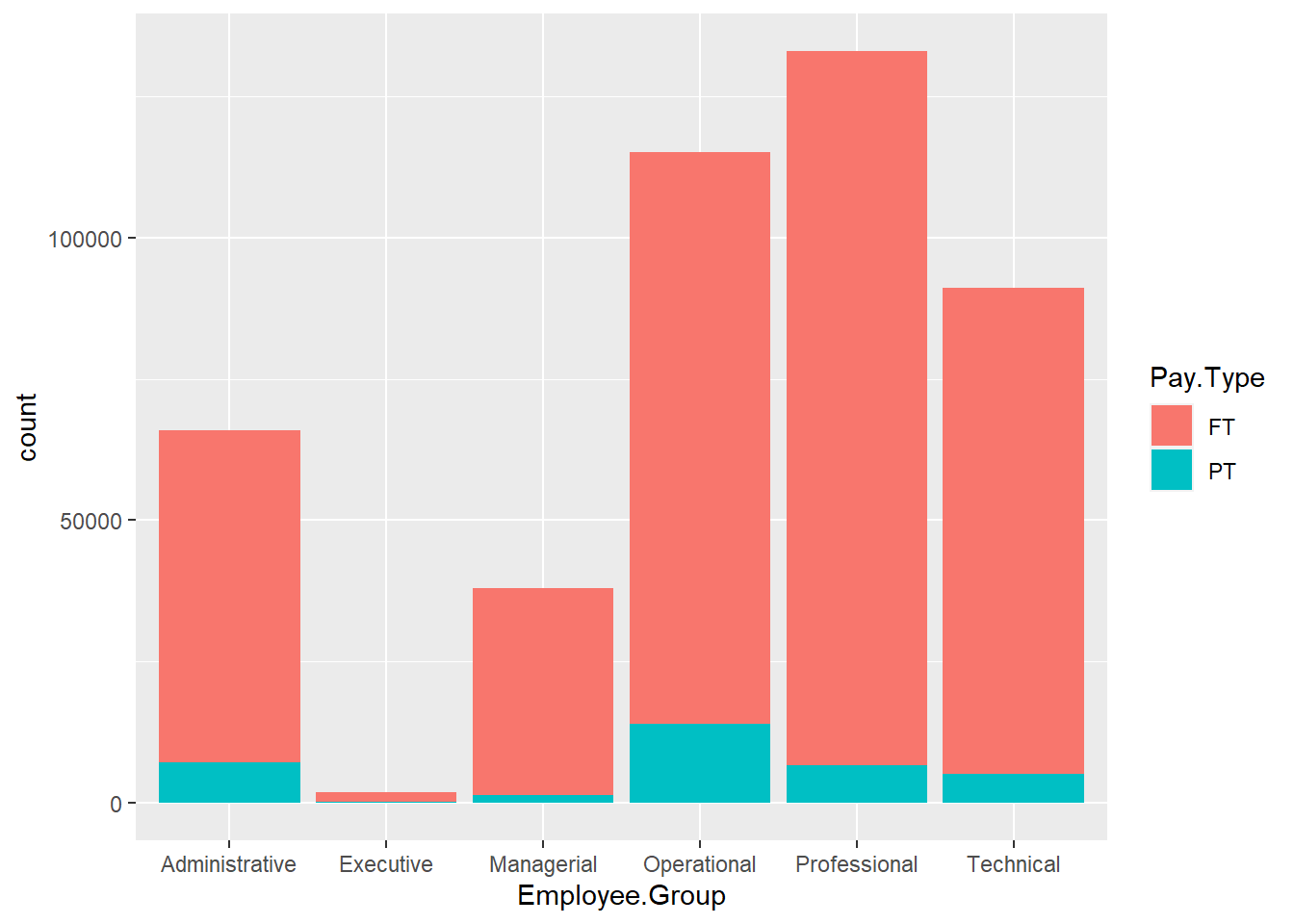
ggplot(Salary, aes(x=Employee.Group, fill=Pay.Type)) +
    geom_bar(stat="count", position="fill")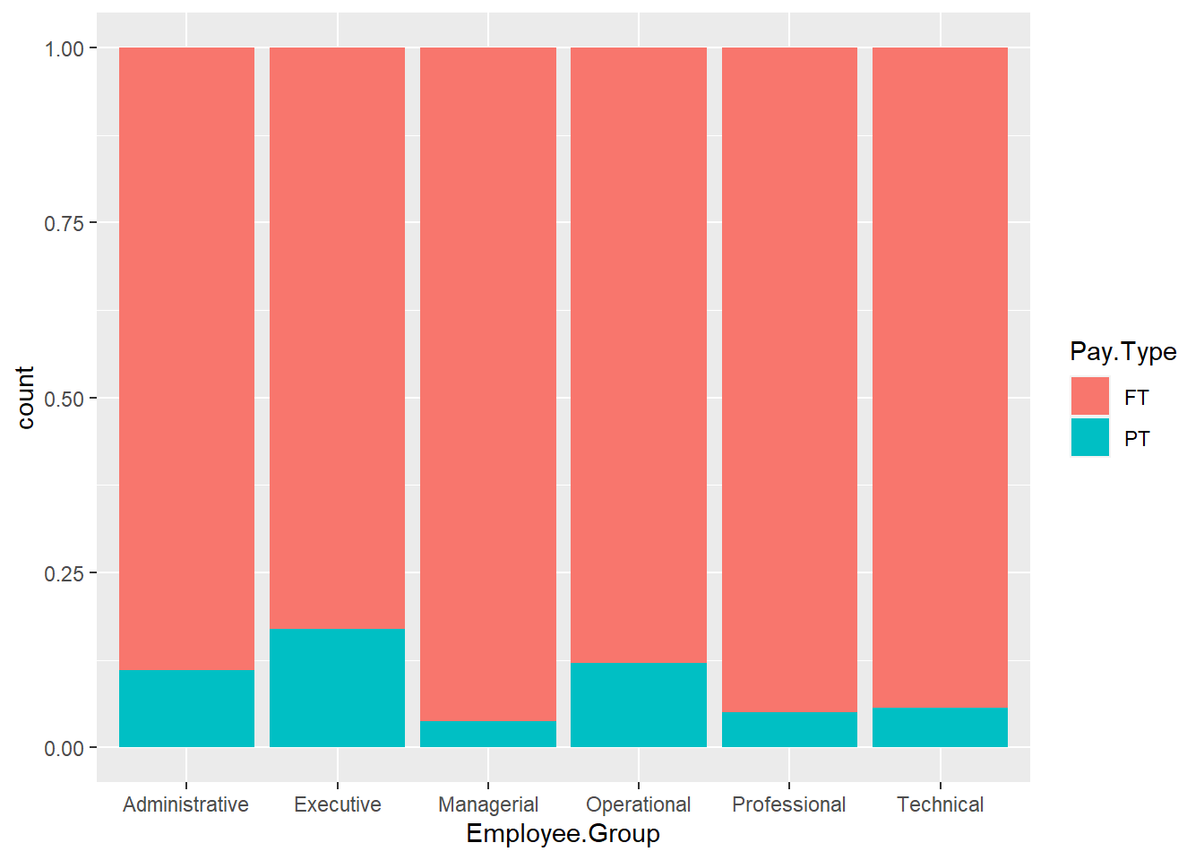
ggplot(Salary, aes(x=Employee.Group, fill=Pay.Type)) +
    geom_bar(stat="count", position=position_dodge())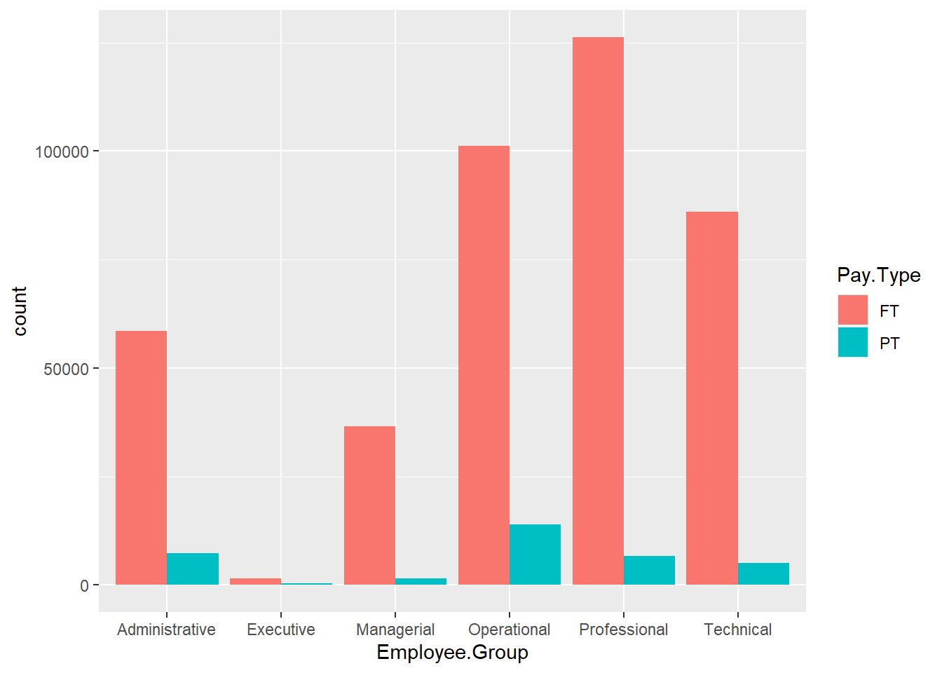
6.2.4 Pie chart
Total.Employee <- Salary %>%
  group_by(Employee.Group) %>%
  summarise(Total.Employee = n()) %>%
  ungroup() %>%
  arrange(desc(Employee.Group)) %>%
  mutate(lab.ypos = cumsum(Total.Employee) - 0.5*Total.Employee)

ggplot(Total.Employee, aes(x="", y=Total.Employee, fill=Employee.Group)) +
  geom_bar(stat="identity") +
  coord_polar("y", start = 0) +
  theme_void()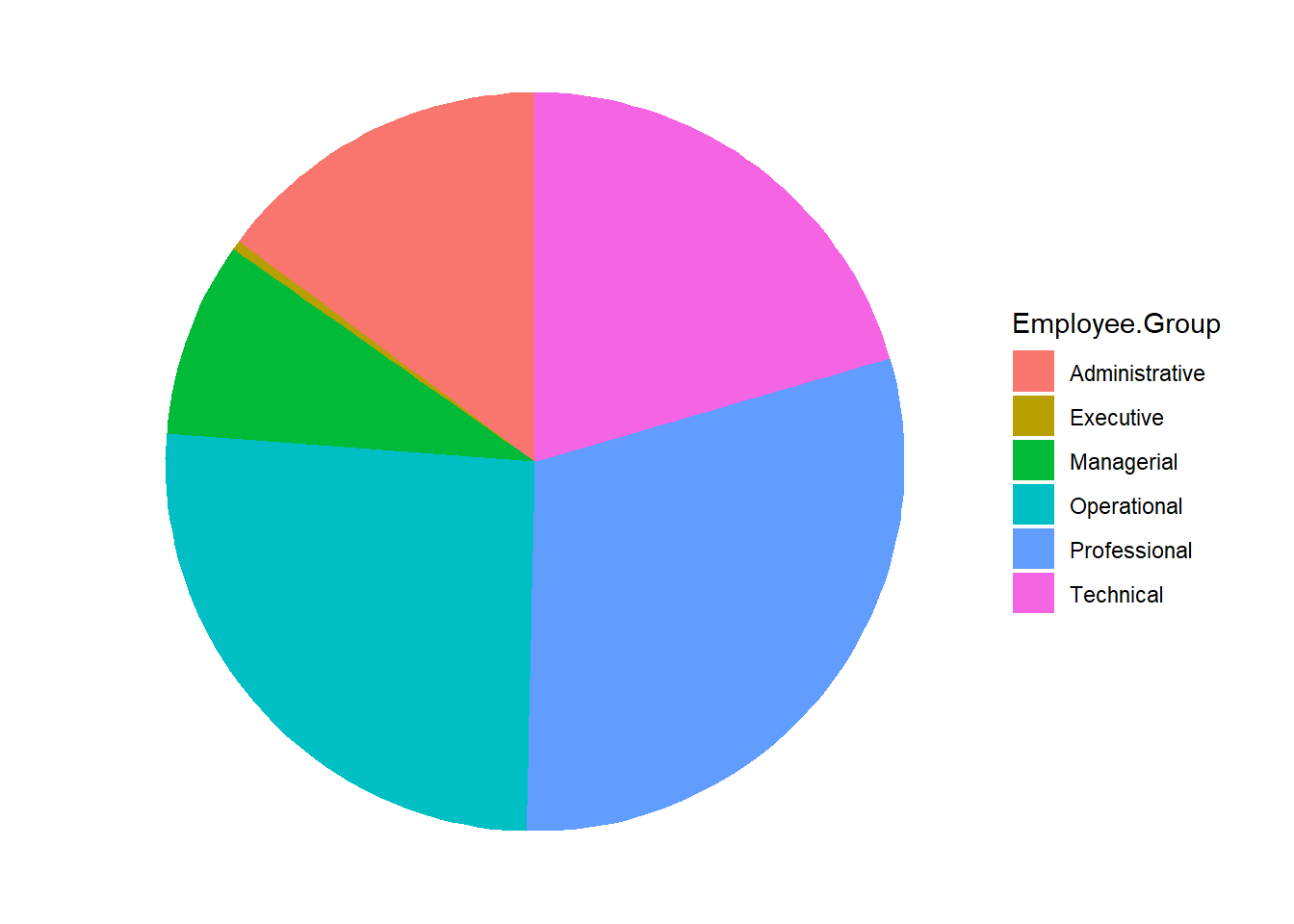
ggplot(Total.Employee, aes(x = 2, y = Total.Employee, fill = Employee.Group)) +
  geom_bar(stat = "identity", color = "white") +
  coord_polar(theta = "y", start = 0)+
  geom_text(aes(y = lab.ypos, label = Employee.Group), color = "white")+
  theme_void()+
  xlim(0.5, 2.5)
6.2.5 Line plot
Salary.by.Year <- Salary %>%
  group_by(Fiscal.Year) %>%
  summarise(Actual.Salary = mean(Actual.Salary.Paid))

ggplot(Salary.by.Year, aes(x=factor(Fiscal.Year), group=1, y=Actual.Salary)) +
    geom_line()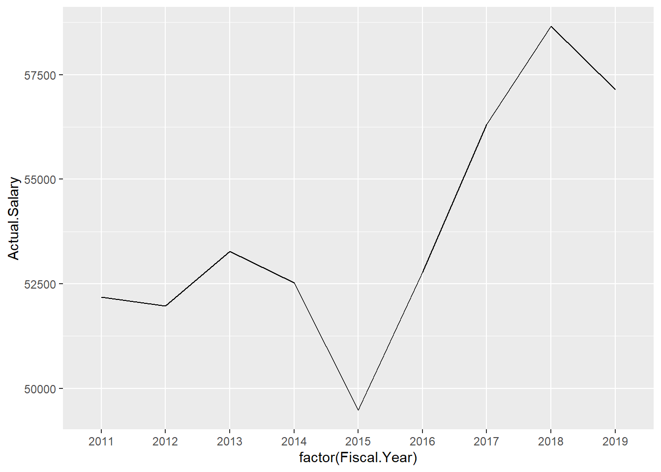
Salary.by.Year <- Salary %>%
  group_by(Fiscal.Year, Employee.Group) %>%
  summarise(Actual.Salary = mean(Actual.Salary.Paid))

ggplot(Salary.by.Year,
       aes(x=factor(Fiscal.Year), y=Actual.Salary, group=Employee.Group, col=Employee.Group)) +
    geom_line()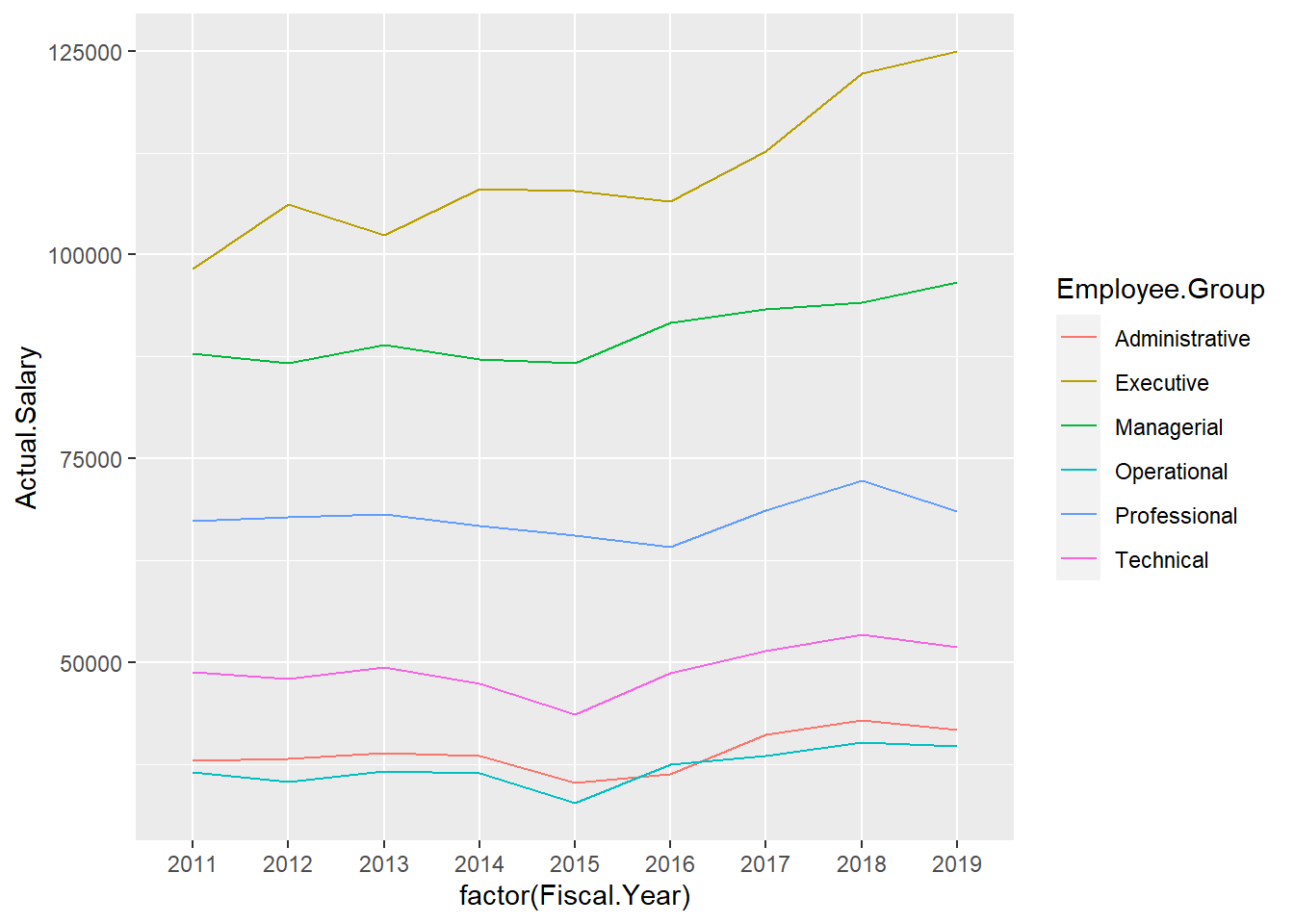
ggplot(Salary.by.Year,
       aes(x=factor(Fiscal.Year), y=Actual.Salary, group=Employee.Group, col=Employee.Group)) +
  geom_line() +
  geom_point()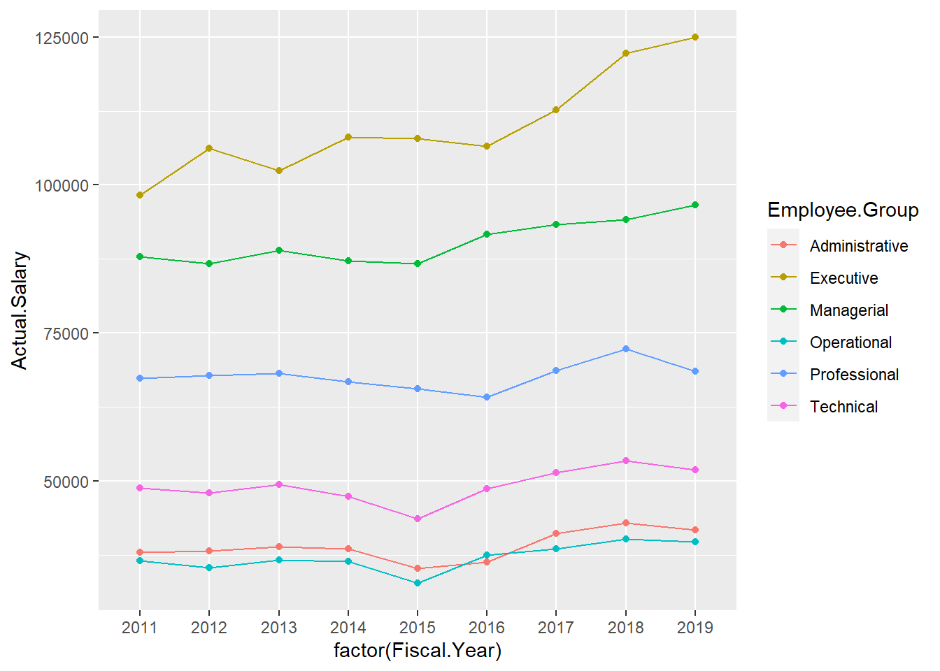
6.2.6 Boxplot
ggplot(Salary, aes(x=Total.Compensation)) + geom_boxplot()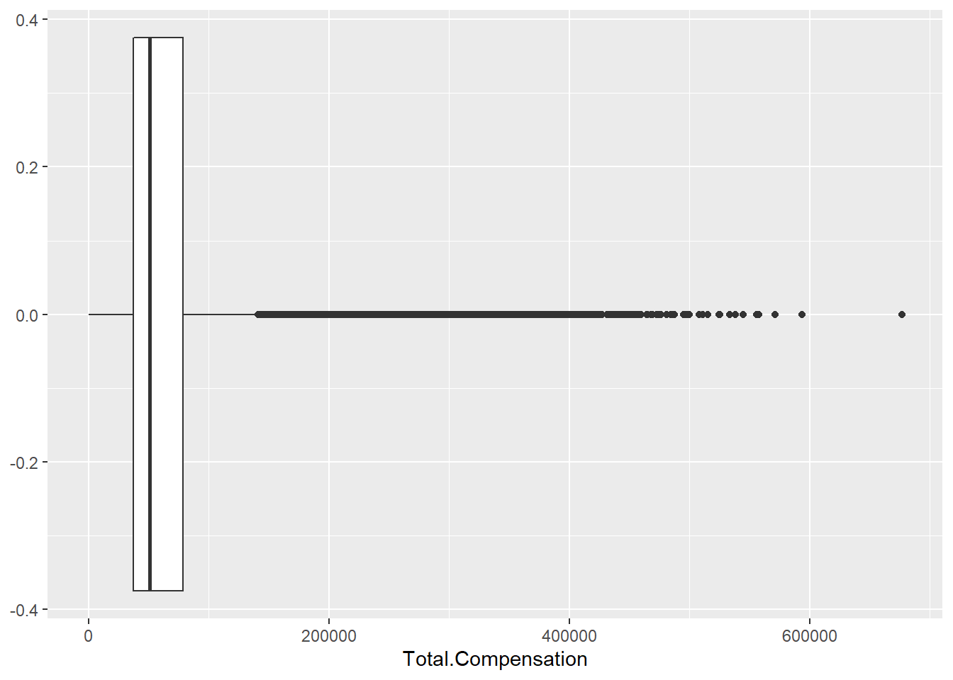
ggplot(Salary, aes(y=Total.Compensation, fill = Employee.Group)) +
  geom_boxplot()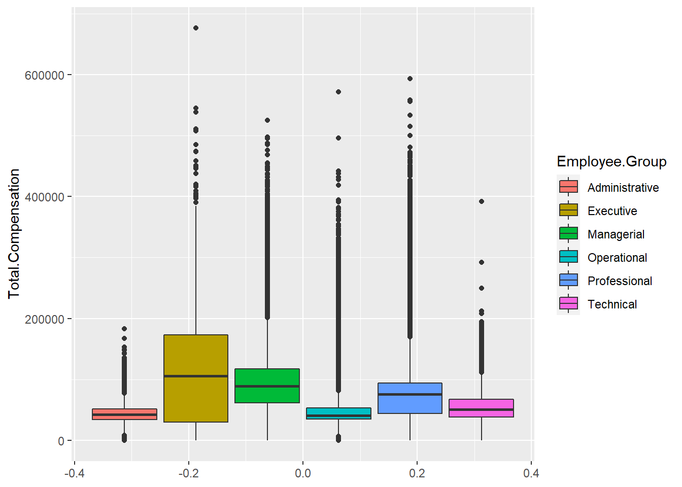
6.2.7 Layout
Menggunakan fungsi plot_grid() dari library cowplot.
library(cowplot)p1 <- ggplot(Salary, aes(y=Total.Compensation)) + geom_boxplot()
p2 <- ggplot(Salary100, aes(x=Base.Annualized.Salary, y=Total.Compensation)) +
geom_point(shape=1)
p3 <- ggplot(Salary, aes(x=Total.Compensation)) +
geom_histogram()
p4 <- ggplot(Salary, aes(x=Total.Compensation)) + geom_density()plot_grid(p1, p2, labels = NULL)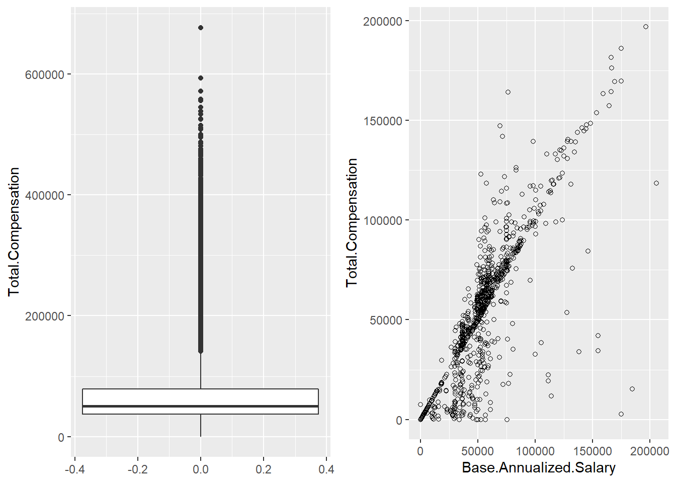
plot_grid(p1, p2, p3, p4, labels = NULL)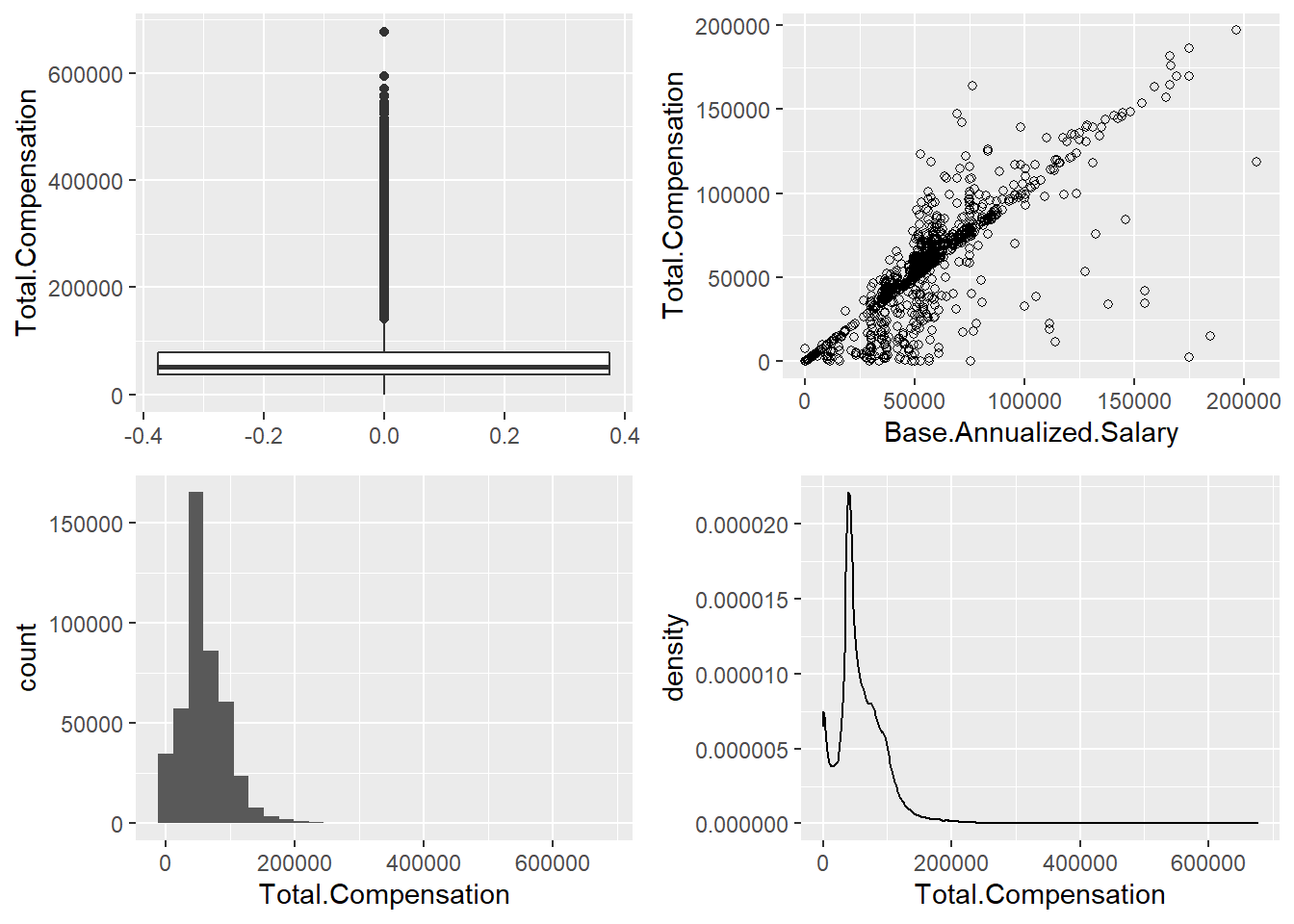
6.3 Visualisasi data spasial
6.3.1 Membaca data
library(sf)
mapIndonesia <- st_read("map/shp/idn_admbnda_adm3_bps_20200401.shp",
                        quiet = TRUE)
Shape file di peroleh dari: data.humdata.org
dplyr::glimpse(mapIndonesia)## Rows: 7,069
## Columns: 17
## $ Shape_Leng <dbl> 0.2798656, 0.7514001, 0.6900061, 0.6483629, 0.2437073, 1.35~
## $ Shape_Area <dbl> 0.003107633, 0.016925540, 0.024636382, 0.010761277, 0.00116~
## $ ADM3_EN <chr> "2 X 11 Enam Lingkung", "2 X 11 Kayu Tanam", "Abab", "Abang~
## $ ADM3_PCODE <chr> "ID1306050", "ID1306052", "ID1612030", "ID5107050", "ID7471~
## $ ADM3_REF <chr> NA, NA, NA, NA, NA, NA, NA, NA, NA, NA, NA, NA, NA, NA, NA,~
## $ ADM3ALT1EN <chr> NA, NA, NA, NA, NA, NA, NA, NA, NA, NA, NA, NA, NA, NA, NA,~
## $ ADM3ALT2EN <chr> NA, NA, NA, NA, NA, NA, NA, NA, NA, NA, NA, NA, NA, NA, NA,~
## $ ADM2_EN <chr> "Padang Pariaman", "Padang Pariaman", "Penukal Abab Lematan~
## $ ADM2_PCODE <chr> "ID1306", "ID1306", "ID1612", "ID5107", "ID7471", "ID9432",~
## $ ADM1_EN <chr> "Sumatera Barat", "Sumatera Barat", "Sumatera Selatan", "Ba~
## $ ADM1_PCODE <chr> "ID13", "ID13", "ID16", "ID51", "ID74", "ID94", "ID94", "ID~
## $ ADM0_EN <chr> "Indonesia", "Indonesia", "Indonesia", "Indonesia", "Indone~
## $ ADM0_PCODE <chr> "ID", "ID", "ID", "ID", "ID", "ID", "ID", "ID", "ID", "ID",~
## $ date <date> 2019-12-20, 2019-12-20, 2019-12-20, 2019-12-20, 2019-12-20~
## $ validOn <date> 2020-04-01, 2020-04-01, 2020-04-01, 2020-04-01, 2020-04-01~
## $ validTo <date> NA, NA, NA, NA, NA, NA, NA, NA, NA, NA, NA, NA, NA, NA, NA~
## $ geometry <MULTIPOLYGON [°]> MULTIPOLYGON (((100.2811 -0..., MULTIPOLYGON (~dataBogor <- read.csv("data/Demografi-Bogor.csv")
dataBogor## Kota Kecamatan KodeBPS KodeKemendagri JumlahPenduduk LuasWilayah
## 1 Kota Bogor Bogor Barat ID3271050 32.71.04 244708 23.08
## 2 Kota Bogor Bogor Selatan ID3271010 32.71.01 208185 31.16
## 3 Kota Bogor Bogor Tengah ID3271040 32.71.03 106359 8.11
## 4 Kota Bogor Bogor Timur ID3271020 32.71.02 105233 10.75
## 5 Kota Bogor Bogor Utara ID3271030 32.71.05 192837 18.88
## 6 Kota Bogor Tanah Sareal ID3271060 32.71.06 218135 21.25
## KepadatanPenduduk
## 1 10603
## 2 6681
## 3 13115
## 4 9789
## 5 10214
## 6 10265mapBogor<- mapIndonesia %>%
dplyr::inner_join(dataBogor, by = c("ADM3_PCODE" = "KodeBPS"))
mapBogor## Simple feature collection with 6 features and 22 fields
## Geometry type: MULTIPOLYGON
## Dimension: XY
## Bounding box: xmin: 106.735 ymin: -6.679585 xmax: 106.8488 ymax: -6.510802
## Geodetic CRS: WGS 84
## Shape_Leng Shape_Area ADM3_EN ADM3_PCODE ADM3_REF ADM3ALT1EN
## 1 0.3644271 0.0018624008 Bogor Barat ID3271050 <NA> <NA>
## 2 0.3413273 0.0025144096 Bogor Selatan ID3271010 <NA> <NA>
## 3 0.1849809 0.0006540943 Bogor Tengah ID3271040 <NA> <NA>
## 4 0.1943379 0.0008671386 Bogor Timur ID3271020 <NA> <NA>
## 5 0.2430896 0.0015239343 Bogor Utara ID3271030 <NA> <NA>
## 6 0.2357695 0.0017147180 Tanah Sereal ID3271060 <NA> <NA>
## ADM3ALT2EN ADM2_EN ADM2_PCODE ADM1_EN ADM1_PCODE ADM0_EN ADM0_PCODE
## 1 <NA> Kota Bogor ID3271 Jawa Barat ID32 Indonesia ID
## 2 <NA> Kota Bogor ID3271 Jawa Barat ID32 Indonesia ID
## 3 <NA> Kota Bogor ID3271 Jawa Barat ID32 Indonesia ID
## 4 <NA> Kota Bogor ID3271 Jawa Barat ID32 Indonesia ID
## 5 <NA> Kota Bogor ID3271 Jawa Barat ID32 Indonesia ID
## 6 <NA> Kota Bogor ID3271 Jawa Barat ID32 Indonesia ID
## date validOn validTo Kota Kecamatan KodeKemendagri
## 1 2019-12-20 2020-04-01 <NA> Kota Bogor Bogor Barat 32.71.04
## 2 2019-12-20 2020-04-01 <NA> Kota Bogor Bogor Selatan 32.71.01
## 3 2019-12-20 2020-04-01 <NA> Kota Bogor Bogor Tengah 32.71.03
## 4 2019-12-20 2020-04-01 <NA> Kota Bogor Bogor Timur 32.71.02
## 5 2019-12-20 2020-04-01 <NA> Kota Bogor Bogor Utara 32.71.05
## 6 2019-12-20 2020-04-01 <NA> Kota Bogor Tanah Sareal 32.71.06
## JumlahPenduduk LuasWilayah KepadatanPenduduk geometry
## 1 244708 23.08 10603 MULTIPOLYGON (((106.7649 -6...
## 2 208185 31.16 6681 MULTIPOLYGON (((106.7961 -6...
## 3 106359 8.11 13115 MULTIPOLYGON (((106.7885 -6...
## 4 105233 10.75 9789 MULTIPOLYGON (((106.8315 -6...
## 5 192837 18.88 10214 MULTIPOLYGON (((106.8183 -6...
## 6 218135 21.25 10265 MULTIPOLYGON (((106.7822 -6...6.3.2 Peta Statis
Peta statis dapat dibuat menggunakan ggplot2
p <- ggplot() +
  geom_sf(data=mapBogor, aes(fill=JumlahPenduduk))
p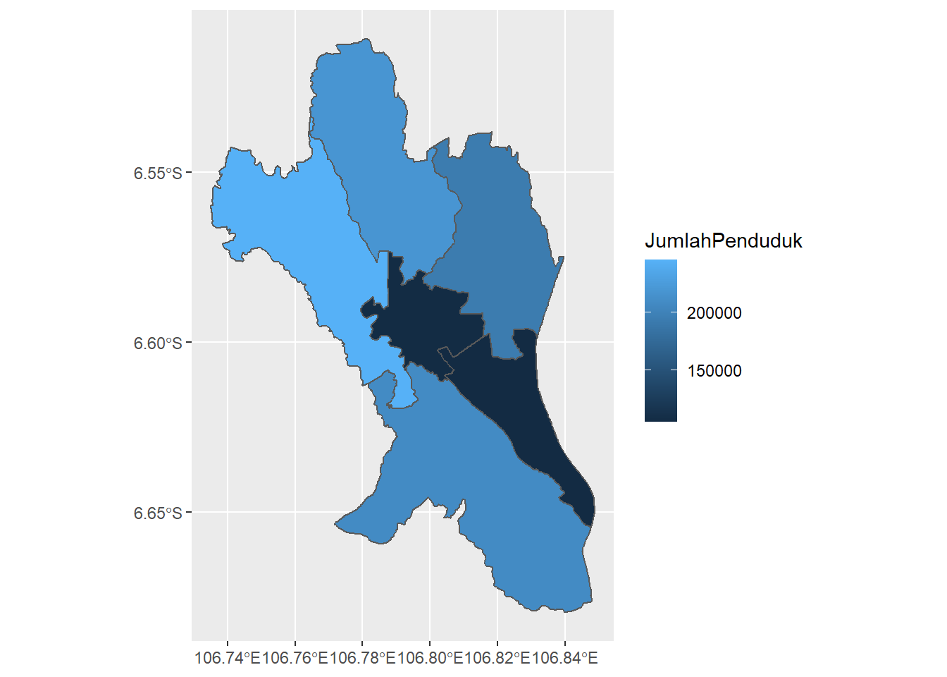
colorPalette = RColorBrewer::brewer.pal(5,"YlGnBu")
legendBreak = c(120,170,230)*1000
yBreak = seq(106.72, 106.86, by=0.04)

p + scale_fill_gradientn(colors = colorPalette,
                       breaks = legendBreak,
                       name = "Jumlah Penduduk") +
  labs(title = "Jumlah Penduduk Kota Bogor")  +
  theme(legend.text = element_text(size=7),
        legend.title = element_text(size=7),
        axis.text.x = element_text(size = 7),
        axis.text.y = element_text(size = 7),
        title = element_text(size=12, face='bold')) +
scale_x_continuous(breaks = yBreak) 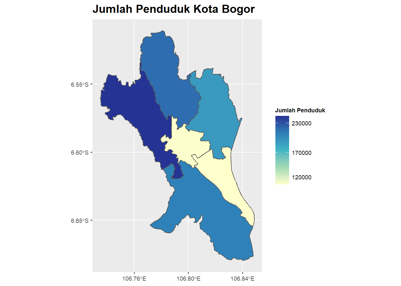
6.3.3 Peta Interaktif
Peta statis dapat dibuat menggunakan leaflet
# opsional, jika belum terinstal
install.packages("leaflet")library(leaflet)Berikut perintah-perintah untuk menampilkan jumlah penduduk Kota Bogor dengan peta leaflet.
leaflet(): inisiasi peta dengan memanggil fungsileaflet()addProviderTiles(): menambahkan peta dasar (base map) dengan perintahaddPolygons(): menabahkan poligon dengan gradasi warna berdasarkan jumlah penduduk. Pengaturan warna gradasi menggunakancolorNumeric(). Ditambahkan pula opsi label untu menampilkan popup, yang akan muncul ketika pengguna menyorot area tertentu.addLegend(): menambahkan legendaaddLayersControl(): menampilkan tombol untuk memilih layer yang akan ditampilkansetView(): mengatur posisi dan zooming default
# membuat custom palette warna
populationPalette <- colorNumeric(
  palette = "YlGnBu",
  domain = mapBogor$JumlahPenduduk
)

# membuat custom popup
popupLabel <- paste0(
    "<b>Kecamatan ", mapBogor$Kecamatan,"</b><br/>",
    "Jumlah Penduduk (jiwa): ", mapBogor$JumlahPenduduk, "<br/>",
    "Luas Wilayah (km2): ", mapBogor$LuasWilayah, "<br/>",
    "Kepadatan Penduduk (jiwa/km2): ", mapBogor$KepadatanPenduduk) %>%
  lapply(htmltools::HTML)
# membuat peta leaflet
leaflet(mapBogor) %>%
addProviderTiles(providers$CartoDB.PositronNoLabels, group = "Light Mode") %>%
addProviderTiles(providers$CartoDB.DarkMatterNoLabels, group = "Dark Mode") %>%
addPolygons(weight = 1,
opacity = 1,
fillOpacity = 0.9,
label = popupLabel,
color = ~populationPalette(JumlahPenduduk),
highlightOptions = highlightOptions(color = "white",
weight = 2,
bringToFront = TRUE) ) %>%
addLegend(position = "bottomright",
pal = populationPalette,
values = ~JumlahPenduduk,
title = "Jumlah\nPenduduk",
opacity = 1) %>%
addLayersControl(position = 'topright',
baseGroups = c("Light Mode", "Dark Mode"),
options = layersControlOptions(collapsed = FALSE)) %>%
setView(lat = - 6.595, lng = 106.87, zoom = 12)Jika peta tidak tampil atau terpotong, bisa dilihat di RPubs berikut: https://rpubs.com/nurandi/simple-choropleth-r-leaflet .